Legacy Charts
Since ActiveUI v4.3.2 these charts were replaced by the newer charts and are hidden by default. Product development teams can enable the Legacy Charts. For more information please refer to the Developer Documentation.
Topics on this page:
- Charts Basics
- Legacy Charts Gallery with step-by-step instructions
- List of Features and Tips
- List of Actions, e.g. showing the data in a table
Charts basics
This section describes the initial configuration of the chart.
Creating a new chart
As with any other data visualization widget, click the chart icon in the dock or drag it from the Widgets Panel to add a new chart.
The next step is to select a chart type. Explore examples in the Legacy Chart Gallery.
Map x and y attributes
Many chart configurations require you to map the x and y attributes:
- x attribute is mapping the horizontal axis
- y attribute is mapping the vertical axis
Depending on the chart type, each axis might expect you to select numeric values (measures) or categories (levels).
After the chart is initially configured, it can still be further configured/updated. Continue reading to learn how.
To limit the scope of the data in a chart, apply Filters.
Axis Options
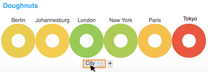
Click on the axis label names to access controls for this axis.
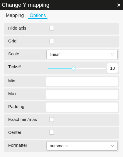
On the first tab of the axis controls, you are invited to change the axis mapping. Switch to the second tab, Options, to see available axis settings. They will look something like this, though the options may be different:
You can also access Axis Options via the Chart Options. Each axis counts as an option, and will be listed at the top. Clicking the axis name within Chart Options opens the same popup with controls for the axis.
Chart Options
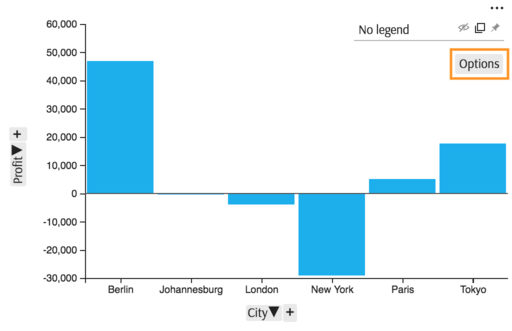
Click on the "Options" button inside the Legend.
You will see a popup similar to this one:
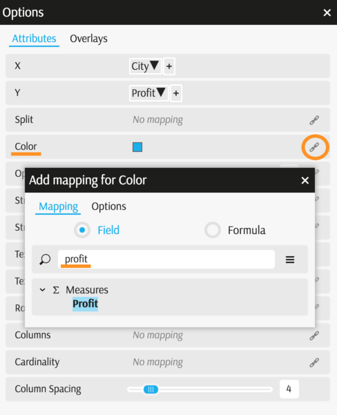
Most chart properties can either be set to a constant or be mapped to a level or to the value of a measure. To map a property to a level or measure:
- Click the "link" icon to the right of the property.
- Choose the level or measure to map the property to.
To unmap a currently-mapped property (which will disable it):
- Click the "link" icon to open the editing popup.
- Click the "Remove mapping" button.
Features
Depending on the chart type and data you selected, different settings will be available for tuning. For example:
- The "Marker Size" option is displayed for the Tree Map and Line types of charts.
- The "Not time" checkbox displays when you pick a datetime-type level for an axis.
An overview of various settings and how they can be used, when available for a chart, is shown below.
These Axis Options are available:
| Property | Use case |
|---|---|
| Hide axis | Check to hide the axis. |
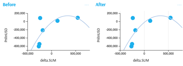
| Grid | Check this option to display the grid (example). |
| Scale | Change "linear" scale to "logarithmic" or "exponential". |
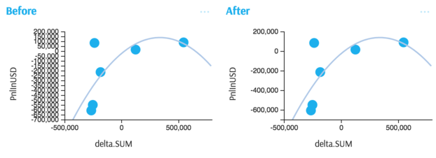
| Ticks# | Change the number of tick marks on the axis line (example). |
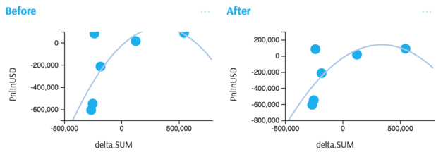
| Min | Set a static minimum scale value (example). If left blank, the value is determined dynamically based on the data. |
| Max | Set a static maximum scale value (example). If left blank, the value is determined dynamically based on the data. |
| Padding | Add some padding to the scale value: the padding will be added to the maximum value and substracted from the minimum value, to prevent elements from overflowing the chart. This attribute is ignored if Min or Max are defined. |
| Exact min/max | Check to use the exact minimum and maximum values from the data for the axis scale values. |
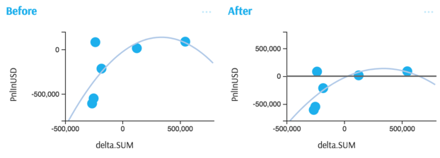
| Center | Check this option to center around zero (example). |
| Not time | When "Not time" is unchecked, values are positioned relative to the time they represent. When it is checked, values are regularly spaced, no matter whether they are one second or one year apart. |
| Domain Extent | For a datetime axis, you can extend the range of times shown by increasing the domain extent above 1. The range shown is the range of the values multiplied by the domain extent. |
| Formatter | For numeric chart axes, you can select a format (available formatter plugins) from a dropdown list. |
These Chart Options are available:
| Property | Use case |
|---|---|
| X | Change the level the X axes are mapped to. |
| Y | Change the level the Y axes are mapped to. |
| Color | Set a custom color or let each chart element's data be dynamically linked to its data (example). |
| Rows | Split the data by a level on rows → as a result, the single chart is replaced by a series of vertically arranged charts (example). |
| Columns | Split the data by a level on columns → as a result, the single chart is replaced by a series of horizontally arranged charts (example). |
| Cardinality | Split chart elements by a level (example). |
| Marker size | Set a custom marker size in pixels or let it be proportional to a measure (example). |
| Stroke color | Change the color of the line or border (depending on the chart type). |
| Stroke width | Change the width of the line or border (depending on the chart type). |
| Size | Set a custom size in pixels or let it be proportional to a measure (example). |
| Text | Set a static value or display measure/level in the labels (example). |
| Text color | Set a custom label color or let it be dynamically linked to the data. |
| Dash spacing | Change a line to 'dashed' format by setting the amount of space between each dash. When empty or 0, lines are solid. |
| Area Opacity | Set opacity from 0 to 1. You can also link the opacity dynamically to the data. |
| Column type | This affects the way the breakdown is displayed. In the case of the "clustered" type, each of the decomposed points is represented as a group of columns. In the case of the "stacked" type, each point remains a single column, visually split into components by color. |
| Inner radius | The radius of the hole in the middle of a pie chart. Defaults to 0; positive values create a "doughnut" shape. |
| Outer radius | By default the pie chart takes all available space. This setting may be used to reduce the size in proportion to the available space. |
Illustrations of features
Below are screenshots "before" and "after" applying some of the charts settings. This is a non-exhaustive list of illustrations and it will be extended in future.
Displaying the grid of an axis
Changing the number of ticks on an axis
Setting the minimum and maximum of an axis
Centering an axis around zero
Tips
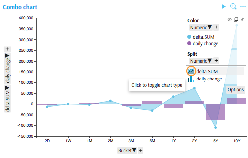
Did you know you can combine Columns, Lines and Areas in one chart? See how:
Start by plotting a measure in a Line or Columns chart
Add another measure (by clicking on "+" next to vertical axis)
Click chart icons in the Legend to toggle between different types:
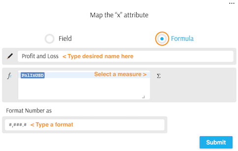
To rename a measure or to change its format:
- When mapping an axis, click "Formula".
- Type the new name in the field "Measure Name".
- Click the insertion button and select the measure from the cube to insert it into the formula.
- Optionally, change the number format.
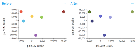
To change the color schema: if the color attribute is used in a chart (see an example – where Color is mapped to Desk), you can change the color schema:
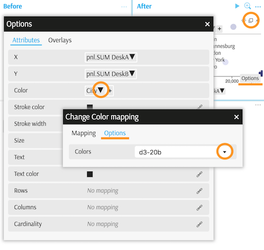
The color schema selector is located in Legend > Chart options > Color mapping > Options tab > Colors field:
Legend
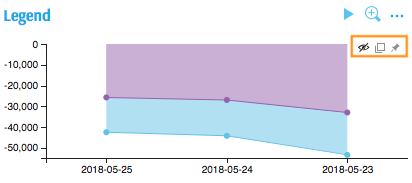
A chart's legend provides a short description of the data and allows you to access the Chart Options.
Legend docking options
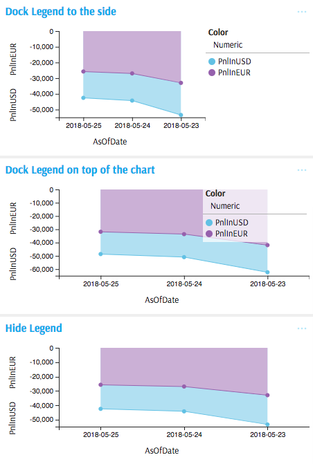
There are three docking options for the legend:
Based on the selection, the legend may be positioned to the right of the chart area, overlaid on the chart area, or hidden:
Actions
Right-click inside the chart area to access the Actions.
Showing the data
To display a chart's underlying data, you can right-click on it and select the "Show data" context menu option:
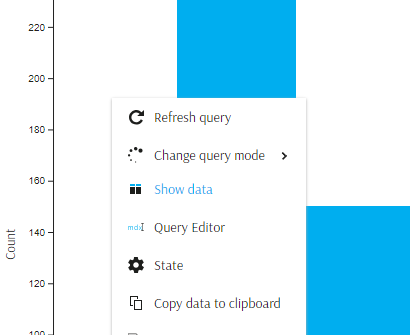
You will be asked where you would like to view the results:
- in a popup
- instead of the current widget
- below the current widget
Check "Remember this choice" if you would like to save the selection as a setting.
Please note that the newly-created table is independent from the chart and will run its own query upon creation:
- The data might have changed since the last chart update. Consider refreshing the chart or enabling real-time in both widgets to ensure data consistency.
- Editing the chart will not affect the table and vice versa.
Remember that you can also export the data behind a chart into the clipboard or a file.
Selecting chart elements
- Click a chart element to select it: the element will be highlighted.
- Click the element again to reset the selection.
- Ctrl + click a chart element to add it to the current selection, or exclude it from the current selection if it was already in it.
- Press the
Escapekey to reset the selection at any time.
Applying a filter
Once a chart element is selected, you can right-click on it and use the context menu option to filter widgets by the selected chart element.
Data Sorting
Since v4.2.3 it has been possible to sort the data in a chart, by clicking an icon next to the axis' label:
![]()
The icon lets you cycle between 'no sort' / 'ascending' / 'descending'. When sorting is enabled, the icon describes the state of the sort.
"Sorting" adds an order() expression into the MDX query. The updated query runs automatically.
Breaking and non-breaking sorts
When you have multiple aggregation levels on an axis, you may need to control whether the sort should be breaking or non-breaking:
- non-breaking means that the sort takes into account the order of the aggregation levels on the axis and sorts higher levels first, then lower levels inside higher categories;
- a breaking sort orders the values, ignoring the structure potentially imposed by the aggregation levels.
By default, the sort is breaking. Speak to your development team to learn how this behaviour can be changed (in State by adding "sortingMode": "non-breaking").
