Charts
ActiveUI SDK 4.3.2 has introduced the new "Charts" widget powered by the Plotly library. Please refer to the Legacy Charts for documentation of the older version of the "Charts" widget.
Quick Start
Adding a New Chart
The location of the "Chart" widget depends on a particular implementation. In many cases, the "Chart" widget can be added from the empty dock or widgets library. In ActiveUI, the "Chart" widget can be added from the left navbar.
If there are multiple cubes connected to your application, you must select the cube containing the data you need for the chart.
Chart Type Switching
By default, a new chart is Line chart. You can switch to a different type of chart using the dropdown menu, located on top of the Content Editor.
Explore the Chart Gallery for examples of chart types.
Subplots
You can add subplots to your chart breaking down the data by an additional attribute.
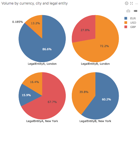
In the example below, a pie chart "Volume by currency" is split by legal entity along the horizontal axis and by city along the vertical axis. Other Chart Types - such as line, bar, columns, etc. - can be split in a similar manner.
By default, the subplot controls are hidden. Content Editor's Show subplot controls action allows to show and later hide the subplot controls.
Explore the Chart Gallery for an example of a chart with subplots.
Data Editing
The "Fields" tab of the Content Editor allows you to select data for your chart:
- Levels (Dimensions)
- Measures
- New calculations, see Calculation Editor.
Many chart configurations require you to map the x and y attributes:
- x attribute is mapping the horizontal axis
- y attribute is mapping the vertical axis
Depending on the chart type, each axis might expect you to select numeric values (measures) or categories (levels).
After the chart is initially configured, it can still be further configured/updated. Continue reading to learn how.
To limit the scope of the data in a chart, apply Filters.
Using the State Editor
This section provides a non-exhaustive list of chart configuration examples using the State Editor widget for advanced users. For more information on Plotly properties, please refer to the Plotly Reference.
Marker Size
To change the marker size, you can set the properties as follows:
"configuration": {
       "plotly": {
           "data": {
                "commonTraceOverride": {
                    "marker": {
                      "size": 5
                    }
                }
            }
        },...
Specific color for bar
The snippet below sets the bar color for a specific measure in a bar chart to "black".
"configuration" : {
    "plotly": {
        "data": {
            "overridesByTraceKey": {
                "[Measures].[PnL.SUM]": {
                    "marker": {
                        "color": "black"
                    }
                }
            }
        }
    }
}
Specific color for line
The snippet below sets the line color for a specific measure in a line chart to "black".
"configuration" : {
    "plotly": {
        "data": {
            "overridesByTraceKey": {
                "[Measures].[PnL.SUM]": {
                    "line": {
                        "color": "black"
                    }
                }
            }
        }
    }
}
Specific colors to be used in a chart
Code to add a list of colors, the chart will pick the color from the given list
"configuration" : {
    "plotly": {
        "layout": {
            "colorway": {
                "red",
                "blue",
                "black",
                "green"
            }
        }
    }
}
Axes Titles
In the below configuration, the y-axis title is set to "RTPL" and the x-axis title is set to "HPL".
"configuration": {
    "plotly": {
              "layout": {
                "xaxis": {
                  "title": "HPL"
                },
                "yaxis": {
                  "title": "RTPL"
                }
              }, ...
Tick Labels
The below snippet illustrates how tick format for y-axis can be set to percentage using the Plotly Tickformat Attribute.
"configuration": {
        "plotly": {
          "layout": {
            "yaxis": {
              "tickformat": "%"
            }
          }
        }, ...
Tick Labels in millions, thousands - M,k
The below settings will add an SI prefix to the tick labels and limit the number of ticks to 5. This is particularly useful when you want to format tick labels as millions "M", or thousands "k".
"configuration": {
    "plotly": {
             "layout": {
               "yaxis": {
                 "tickformat": "s",
                 "nticks": 5
               }
             }
           }, ...
Legend Position
With the below configuration, the chart legend will be placed at the bottom of the chart.
"configuration": {
       "plotly": {
         "layout": {
           "legend": {
             "x": 0,
             "y": -0.2,
             "yanchor": "top"
           }
         }
       }, ...
Actions
Right-click inside the chart area to access the Actions.
Showing the data
To display a chart's underlying data, you can right-click on it and select the "Show data" context menu option. The data will be displayed in a new tab.
Please note that the newly-created table is independent from the chart and will run its own query upon creation:
- The data might have changed since the last chart update. Consider refreshing the chart or enabling real-time in both widgets to ensure data consistency.
- Editing the chart will not affect the table and vice versa.
Remember that you can also export the data behind a chart into the clipboard or a file, or save plot as PNG using an icon on the floating toolbar.
Selecting chart elements
- Click a chart element to select it: the element will be highlighted.
- Click the element again to reset the selection.
- Ctrl + click a chart element to add it to the current selection, or exclude it from the current selection if it was already in it.
- Press the
Escapekey to reset the selection at any time.
Applying a filter
Once a chart element is selected, you can right-click on it and use the context menu option to filter widgets by the selected chart element.
Floating Toolbar
On the top right of the chart area, you can find the floating toolbar with the following icons:
- Download plot as a png
- Zoom
- Pan
- Box select
- Lasso select
- Zoom in
- Zoom out
- Autoscale
These icons provide standard actions of the Plotly Modebar.