Side-by-side - Rows mapping
Example
Summary of settings
- Type of chart: Columns
- Mapping of
yattribute: Curve Exposure - Mapping of
xattribute: DateBucket - Common attributes → Rows mapped to Currency
Step-by-step instruction
Add new Chart Widget
Select Columns
If there are multiple cubes connected to your application, you must select the cube you want for the chart.
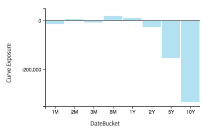
To map the
xattribute, select the groups you would like to see on the horizontal axis, in this example members of DateBucket dimensionTo map the
yattribute, select the value (measure) corresponding to the vertical axis, in this case Curve ExposureThe chart displays with both axes mapped:
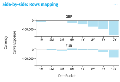
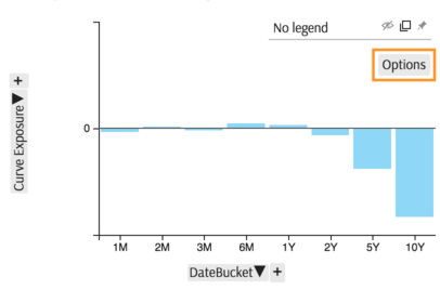
To produce multiple charts for a side-by-side comparison, in this case Curve Exposure levels for different members of the Currency dimension, click Options in the legend area of the chart:
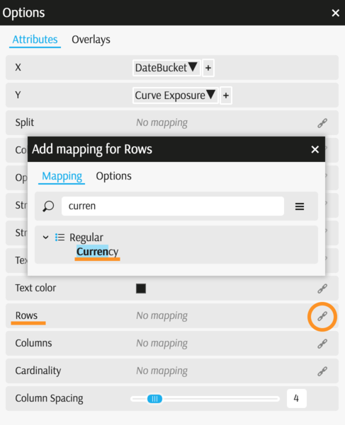
In the Options popup, find the Rows attribute and map it to the desired dimension.
Apply a filter to limit the scope, selecting two currencies. You can also select the top 3 members by a measure (see Filters).
The chart is complete:
Back to Legacy Chart Gallery
Appendix
The appendix contains code snippets for advanced users.
MDX:
SELECT
  [Measures].[Curve Exposure] ON COLUMNS,
  NON EMPTY Crossjoin(
    [Time].[TimeBucket].[DateBucket].Members,
    [Currency].[Currency].[Currency].Members
  ) ON ROWS
  FROM (
    SELECT
    {
      [Currency].[Currency].[ALL].[AllMember].[EUR],
      [Currency].[Currency].[ALL].[AllMember].[USD]
    } ON COLUMNS
    FROM [EquityDerivativesCube]
  )
JSON:
{
  "configurations": [
    {
      "handlers": {
        /* ... */
      },
      "type": "combo-histogram",
      "mapping": {
        "x": {
          "from": ["[Time].[TimeBucket].[DateBucket]"]
        },
        "y": {
          "from": "[Measures].[Curve Exposure]"
        },
        "row": {
          "from": ["[Currency].[Currency].[Currency]"]
        }
      },
      "legend": {
        "display": "hidden"
      }
    }
  ]
}