Featured Values
The "Featured Values" is one of the data visualization widgets:

Quick Start
Adding a Featured Values widget
A new Featured Values widget can be added:
- from the Empty Dock,
- from the Add new widgets action,
A saved "Featured Values" widget can be added to a dashboard from the Bookmarks Tree.
Some of these features may be disabled or look different in your application. Please liaise with the product development team in your organization regarding any changes.
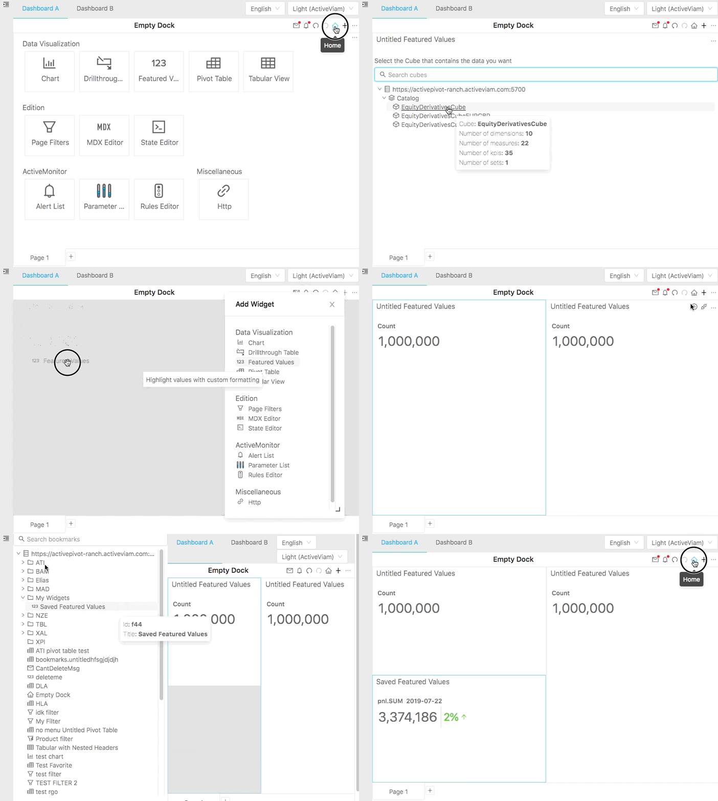
In this demonstration the first widget is added from the Empty Dock, the second one using the Add new widgets action and lastly a saved widget is added from the Bookmarks Tree.
Editing Content
Upon initial display, the Featured Values widget returns a default value, contributors.COUNT. You will want to replace it with the measure of interest.
You can select measures, dimensions and filters using the Content Editor.
Comparison Tool
The "Fields" tab of the Content Editor allows adding an in-place comparison:

Read how to use the Comparison Tool.
Filters
Apply Filters if you want the measure to reflect a specific subset of data. Read more about how to apply Filters.
Features
Below is a list of notable "Featured Values" widget features. To read more about generic actions available for all data visualization widgets, follow this link.
Custom Formatting
To define default and conditional formatting, click Formatting in the context menu of an individual value:
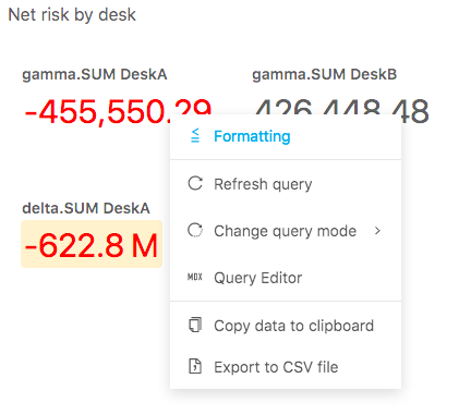
Please note that formatting is defined per measure. MDX allows one to apply conditional formatting to highlight/format values based on a business rule, for instance, depending on materiality threshold. Read more about Conditional Formatting.
Title and description
In addition to editing the widget's title bar, you may:
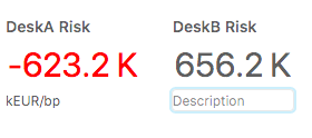
- type in a new title for individual featured values. The title field displays data headers and measure name/caption by default. In the below screenshot, the title is "DeskA Risk"
- type in a description. In the below screenshot, the description is "kEUR/bp"
Save widget
You can save the widget using "Save as" action available for Widgets.
Advanced layout settings
Some of the layout settings can be adjusted using State.
Width
The width of a featured value is defined by the width of its main value. Therefore, the title and description will never go beyond that width. If you need to hardcode a particular width, you can do so by defining the width attribute inside the Featured Values configuration:

"configuration": {
       "featuredValues": {
         "locations": {...
         },
         "width": 350
       }
     }
Title and description color
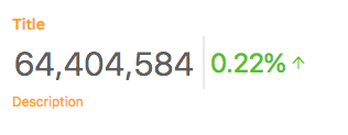
You can change the default Title and Description font color using the color attribute. Please note, that Formatting only changes the color of the actual value, while the title and description are the default text color. You can change the title and description color by defining the color attribute inside the configuration as well:
"configuration": {
       "featuredValues": {
         "locations": {...
         },
         "color": "orange"
       }
     }
Comparison rounding
You can change the comparison to display more decimal places by adding the comparisonRounding property:

"configuration": {
       "featuredValues": {
         "locations": {...
         },
         "comparisonRounding": 4
       }
     }
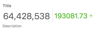
Comparison as difference
You can change the comparison to display raw difference instead of percentage difference using the displayType property:
"configuration": {
       "featuredValues": {
         "locations": {...
         },
         "displayType": "difference"
       }
     }
