Widgets panel
The Widgets panel contains all of the available widgets in your application. It is located to the right of the Tools panel and can be collapsed, hidden, or expanded.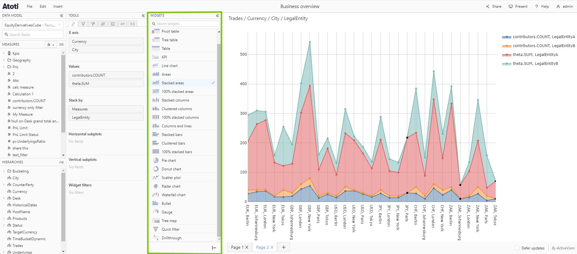
- Add new widgets.
- Switch the type of a widget.
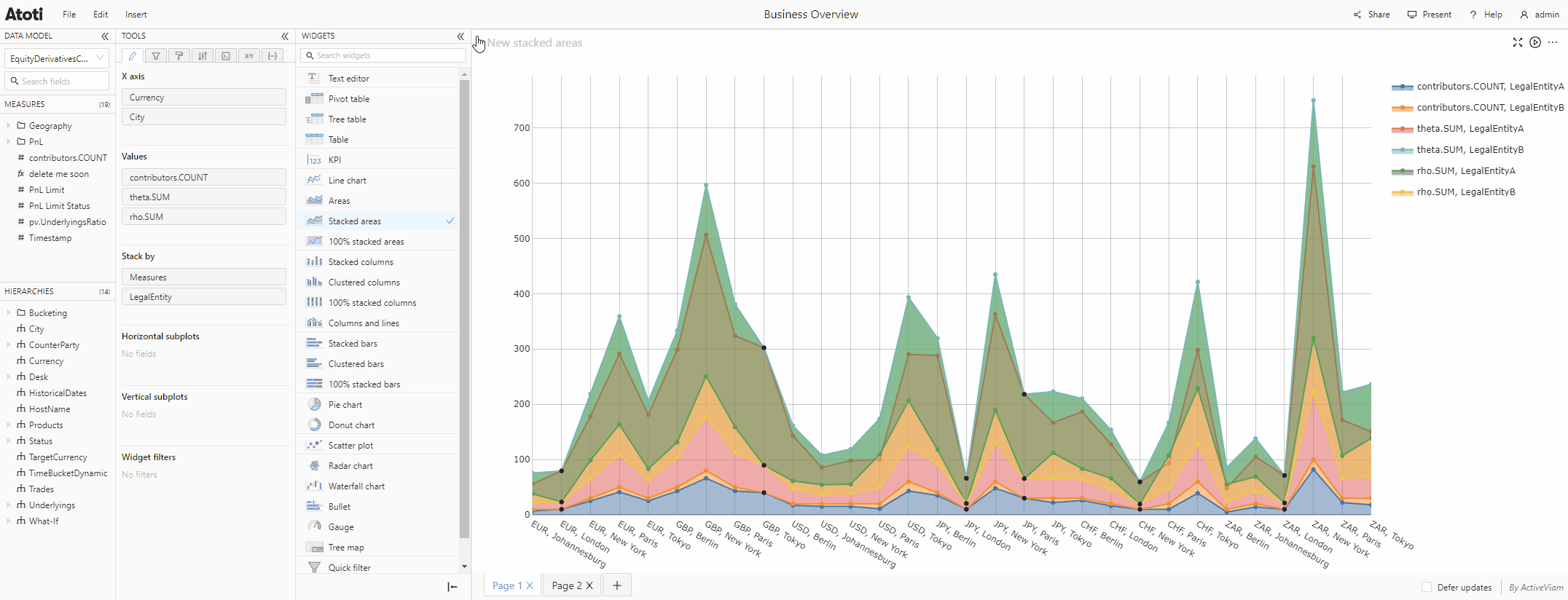
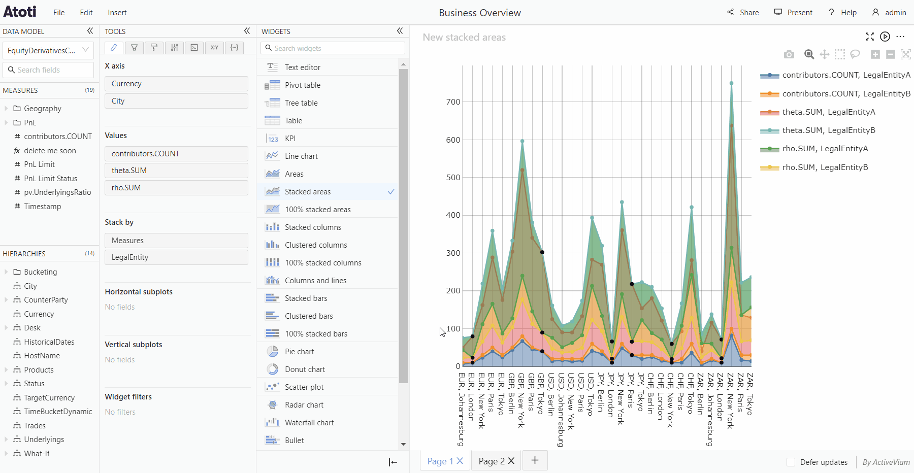
Types of widgets
Many different types of widgets are available in the application. The majority are used to visualize data, for example, a Pivot table or a Line chart, but some widgets also provide extra controls or information for the user, for example, the Text editor.Widgets are plugins, so your application may not include all of the widget
types listed here. If you cannot find a specific widget type in your Widgets
panel, contact your system administrator.
Tables
There are different types of table widgets available in the application.- Pivot table
- Tree table
- Table
- Drillthrough table
KPI widgets
KPI widgets allow you to see the values of high level indicators at a glance. There are two types of KPI configurations:- KPI - shows the totals for the members of the added hierarchy for each added measure.
- Comparison KPI - enables you to compare values for 2 members from the same hierarchy. For example, you could choose to compare values for USD and GBP from the Currency hierarchy.
KPI widgets are often used to compare values across 2 dates. In this situation, the “Compare current date to previous date” option allows to always compare the latest 2 dates. This way, the widget remains relevant day after day, even when new data comes in.This feature is only available for slicing hierarchies within dimensions of type
"TIME".Charts
Atoti UI uses Plotly charts for chart based data visualization. The available Plotly charts are:| Line charts | Column charts | Bar charts | Pie charts | Other |
|---|---|---|---|---|
| Line chart | Stacked columns | Stacked bars | Pie chart | Scatter plot |
| Areas | Clustered columns | Clustered bars | Donut chart | Radar chart |
| Stacked areas | 100% stacked columns | 100% stacked bars | Waterfall chart | |
| 100% stacked areas | Columns and lines | Bullet chart | ||
| Gauge | ||||
| Tree map | ||||
| 3D surface chart | ||||
| Sunburst chart |