Scatter Plot with Gradient color of Points
Example
Summary of settings
- Type of chart: Scatter
- Mapping of "y" attribute: Profit
- Mapping of "x" attribute: Size
- Cardinality: City
- "Color" mapped to a third measure of interest, Count
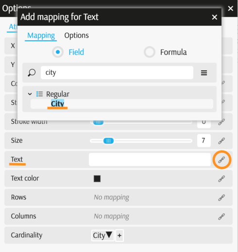
- "Text" mapped to City
Step-by-step instruction
Add new Chart Widget
Select "Scatter"
If there are multiple cubes connected to your application, you must select the cube you want for the chart.
To map the "x" attribute, select a measure or a formula for horizontal axes, in this example, Size.
Map the "y" attribute the same way as the "x" attribute, in this example, Profit.
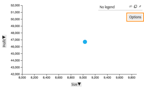
The chart displays one point, the total for measure selected on "x" axes plotted against total for measure selected on "y" axes.
Select the members of the dimension City, by clicking Options in the Legend area of the chart:
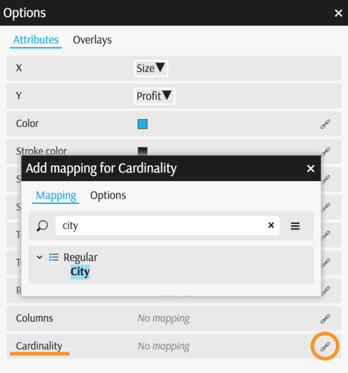
In the Options popup you can change various attributes, in this case map "Cardinality" to City:
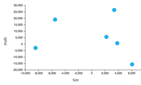
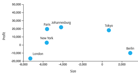
The chart displays with six points on the scatter plot, since there are six members in the City dimension having Size and Profit linked to them:
Use filters to limit the scope of data in the view Filters
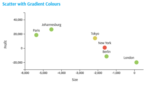
To display the names of City member, go back to Options (in the Legend) and map "Text" to City:
The text labels display:
Map "Color" to the third measure of interest in the same Option popup.
For this example, map color to
contributors.COUNT: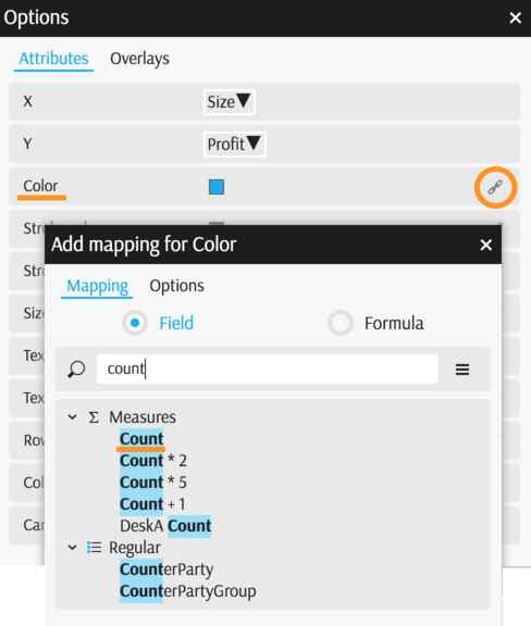
The chart is complete now. New York is very different from all other points because the number of contributors, contributors.COUNT, is low.
Back to Chart Gallery
Appendix
The appendix contains code snippets for advanced users.
MDX:
SELECT
  {
    [Measures].[Profit],
    [Measures].[Size],
    [Measures].[contributors.COUNT]
  } ON COLUMNS,
  NON EMPTY [Geography].[City].[City].Members ON ROWS
  FROM [EquityDerivativesCube]
JSON:
{
  "configurations": [
    {
      "handlers": {
        /* ... */
      },
      "type": "scatter",
      "mapping": {
        "x": {
          "from": "[Measures].[Size]",
          "ticks": 7
        },
        "y": {
          "from": "[Measures].[Profit]",
          "ticks": 5
        },
        "cardinality": {
          "from": ["[Geography].[City].[City]"]
        },
        "text": {
          "from": ["[Geography].[City].[City]"]
        },
        "color": {
          "from": "[Measures].[contributors.COUNT]"
        }
      },
      "legend": {
        "display": "hidden"
      }
    }
  ]
}