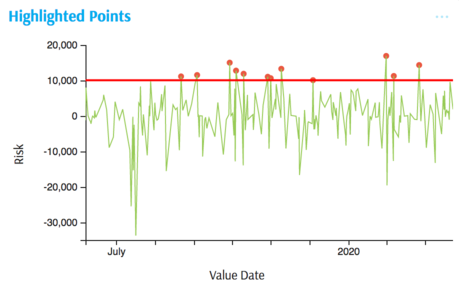
Highlighted Points
Example
Summary of settings
- Type of chart: Lines
- Mapping of "y" attribute: Risk
- Mapping of "x" attribute: Value Date
- Color mapped to
iif()MDX expression - Option → Common attributes → Line → Marker size mapped to
iif()MDX expression
Step-by-step instruction
Add new Chart Widget
Select "Line"
If there are multiple cubes connected to your application, you must select the cube you want for the chart.
To map the "x" attribute, select the time dimension, in this case Value Date
To map the "y" attribute, select the value (measure) corresponding to vertical axes, in this case Risk
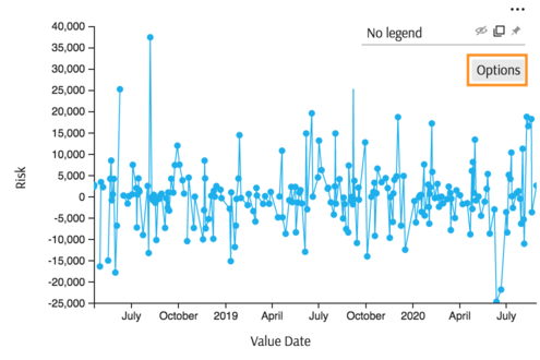
The chart displays with axes mapped.

To keep markers only for those points where the value is above some threshold, for example 10000. Click Options in the Legend area of the chart:
In the lower part of the Options popup find attributes specific to Line chart, in particular "Marker size" attribute. Map it to a formula, returning 3 (pixels) for outliers and 0 for the rest.
 iif(
     [Measures].[Risk] > 10000,
     3,
     0
 )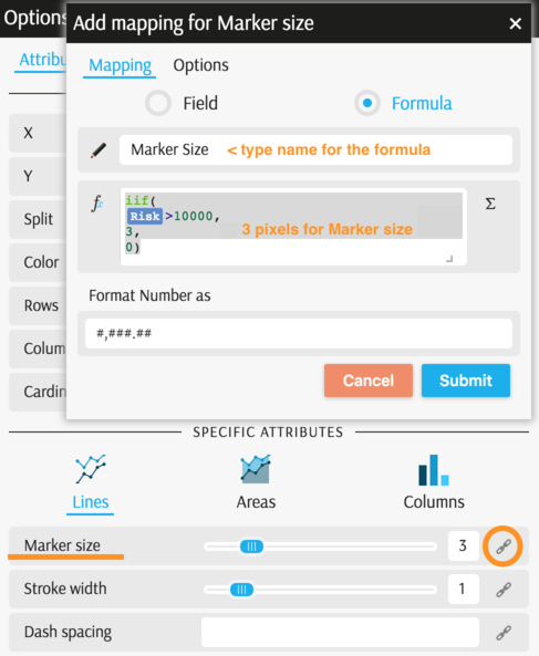
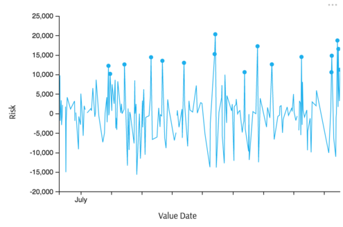
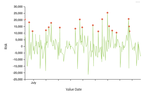
Now only the outliers are marked:
Finally, assign colors. Generate two values for the color scale: zero for outliers and one for the rest. In the Options popup (from Legend) find the field "Color" and map it to a formula:
 iif(
     [Measures].[Risk] > 10000,
     0,
     1
 )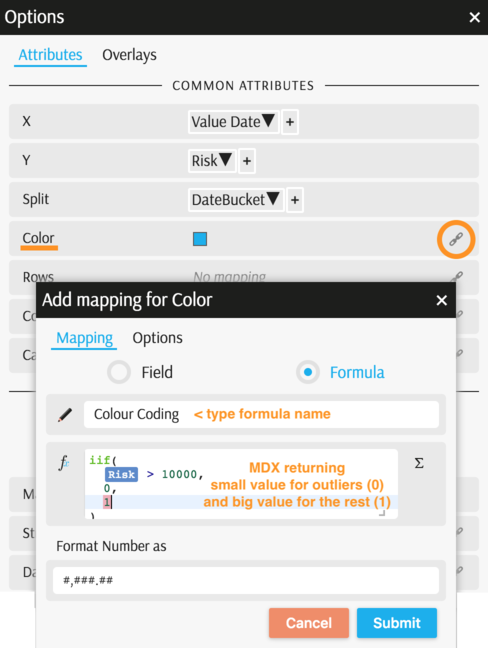
The chart is almost complete:
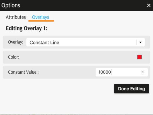
To add a horizontal line for threshold, open Options popup (from Legend) and find the "Overlay" tab:
The example is complete:
Back to Chart Gallery
Appendix
The appendix contains code snippets for advanced users.
MDX:
WITH
 Member [Measures].[Color Coding] AS iif(
  measures.[Risk] > 10000,
  0,
  1
), FORMAT_STRING = "#,###.##"
 Member [Measures].[Marker Size] AS iif(
  measures.[Risk] > 10000,
  3,
  0
), FORMAT_STRING = "#,###.##"
SELECT
  {
    [Measures].[Color Coding],
    [Measures].[Marker Size],
    [Measures].[Risk]
  } ON COLUMNS,
  NON EMPTY [Time].[TimeBucket].[Value Date].Members ON ROWS
    FROM [EquityDerivativesCube]
JSON:
{
  "configurations": [
    {
      "handlers": {
        /* ... */
      },
      "type": "combo-line",
      "mapping": {
        "x": {
          "from": ["[Time].[TimeBucket].[Value Date]"],
          "domainExtent": 1,
          "labelsInterval": 6
        },
        "y": {
          "from": "Value",
          "ticks": 6
        },
        "split": {
          "from": ["numeric"],
          "numericMembers": ["[Measures].[Risk]"]
        },
        "color": {
          "from": "[Measures].[Color Coding]"
        },
        "line@size": {
          "from": "[Measures].[Marker Size]"
        }
      },
      "legend": {
        "display": "hidden"
      },
      "overlays": [
        {
          "key": "constant",
          "args": {
            "color": "#ff0000",
            "value": 10000
          }
        }
      ]
    }
  ]
}