Bubble Chart
Example
Summary of settings
- Type of chart: Scatter
- Mapping of "y" attribute: Risk
- Mapping of "x" attribute: Profit and Loss
- Cardinality: Desk
- "Size" mapped to the third measure of interest using a formula
- "Text" mapped to Desk
- "Color" mapped to Desk
Step-by-step instruction
Add new Chart Widget
Select "Scatter"
If there are multiple cubes connected to your application, you must select the cube you want for the chart.
To map the "x" attribute, select a measure or a formula for the horizontal axis, in this case - Profit and Loss.
Map the "y" attribute in the same way you mapped the "x" attribute, in this case to Risk.
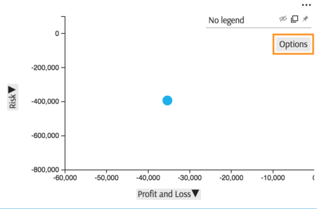
The initial chart displays one point, total for measure selected on "x" axis plotted against total for measure selected on "y" axis:
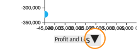
If there are too many ticks on any of the axis, click on the axis label:
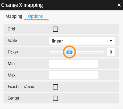
Then in "Options" tab reduce the number of ticks:
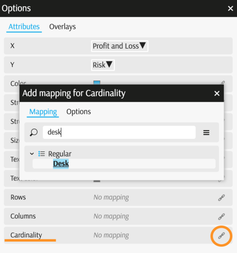
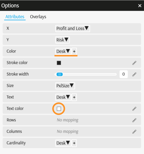
Select Members you would like to display on the chart, in this case members of the dimension Desk . Click Options in the legend area of the chart:
In the Options popup you can change various attributes. In this case, map "Cardinality" to Desk:
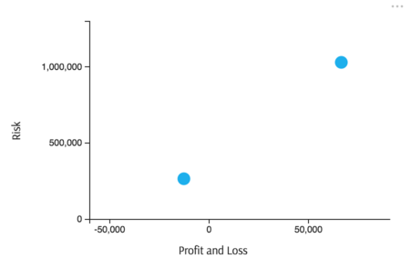
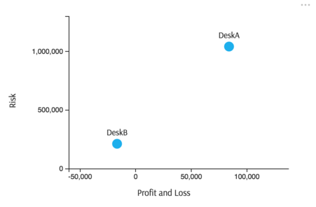
The scatter displays two points, since there are two members in the Desk dimension:
To restrict data in the view, use Filters
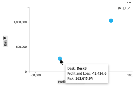
Mouse hover displays which point is "DeskA" and which point is "DeskB".
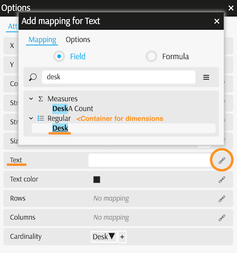
You can also add labels to display relevant information next to the points:
Go to Options in the Legend again and map the attribute "Text" to the same dimension as Cardinality:
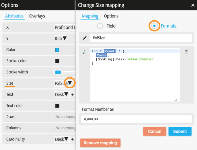
Finally, assign each point a size, proportional to the third measure of interest.
Size should be expressed in pixels and should be proportional to a positive measure.
In this example, link size to the measure
contributors.COUNTin the cube.Below is the formula used to allocate 100 pixels to Members proportionally. Instead of 100 pixels, you may allocate a smaller or bigger number of pixels depending on space available to the chart.
100 * [Measures].[contributors.COUNT] / (
  [Measures].[contributors.COUNT],
  [Booking].[Desk].[ALL].[AllMember]
)
Expression in brackets - having defaultmember - returns total across all the members for a given measure:
(
  [Measures].[contributors.COUNT],
  [Booking].[Desk].[ALL].[AllMember]
)
To map this formula to the Size attribute, open Options popup from the Legend again and set the size as follows:
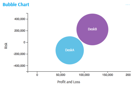
Now the visualization shows that although it is more profitable and riskier, "DeskA" turns out to be smaller:
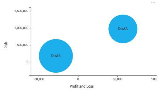
You may also map "Text Color" to white and "Color" to the Desk dimension:
The chart is complete:
Back to Chart Gallery
Appendix
The appendix contains code snippets for advanced users.
MDX:
WITH
 Member [Measures].[Size] AS 100 * [Measures].[contributors.COUNT] / (
  [Measures].[contributors.COUNT],
  [Booking].Desk.defaultmember
), FORMAT_STRING = "#,###.##"
SELECT
  NON EMPTY {
    [Measures].[Pnl],
    [Measures].[Risk],
    [Measures].[Size]
  } ON COLUMNS,
  NON EMPTY [Booking].[Desk].[Desk].Members ON ROWS
  FROM [EquityDerivativesCube]
JSON:
{
  "configurations": [
    {
      "handlers": {
        /* ... */
      },
      "type": "scatter",
      "mapping": {
        "x": {
          "from": "[Measures].[Pnl]",
          "ticks": 4
        },
        "y": {
          "from": "[Measures].[Risk]",
          "ticks": 6
        },
        "color": {
          "from": ["[Booking].[Desk].[Desk]"]
        },
        "r": {
          "from": "[Measures].[Size]"
        },
        "text": {
          "from": ["[Booking].[Desk].[Desk]"]
        },
        "textColor": {
          "value": "rgb(255, 255, 255)"
        }
      },
      "legend": {
        "display": "hidden"
      }
    }
  ]
}