Clustered Columns Chart
Example
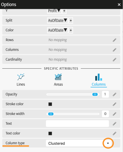
Summary of settings
- Type of chart: Columns
- Mapping of "x" attribute: City
- Mapping of "y" attribute: Profit
- Filters: Two historical dates selected
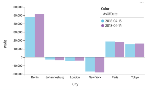
- Common attributes → "Split" mapped to AsOfDate dimension
- Specific attributes → Columns → "Column Type" set to Clustered
Step-by-step instruction
Add new Chart Widget
Select "Columns"
If there are multiple cubes connected to your application, you must select the cube you want for the chart.
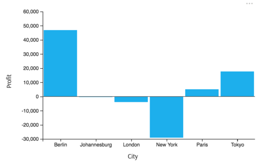
To map the "x" attribute, select the groups you would like to see on horizontal axes, City
To map the "y" attribute, select the value (measure) corresponding to the vertical axes, Profit
The chart displays the mapped axes:
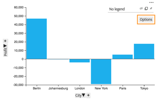
To split columns by AsOfDate, in order to compare day-to-day dynamics, click Options in the legend area of the chart:
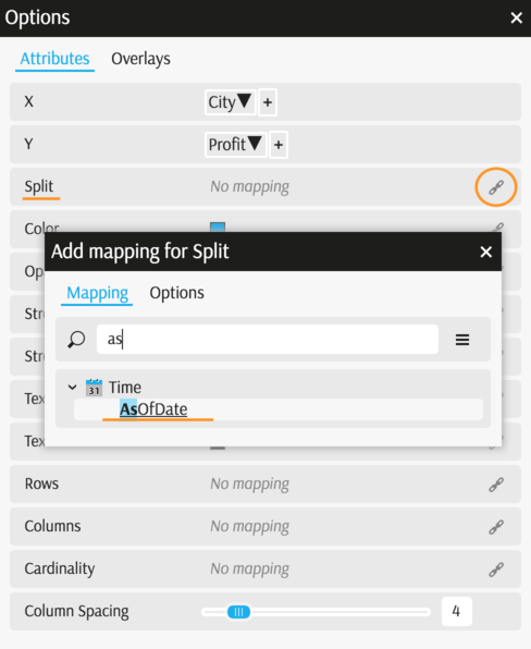
In the Options popup, find attribute "Split" and map it to the desired dimension.
Apply a filter to view only the two dates needed Filters)
In the Options popup, scroll down and notice "Specific attributes" section. Click the "Columns" icon and find a setting called "Column type". By default it is set to "Clustered." Change it to "Stacked" and compare.
The example is complete:
Back to Chart Gallery
Appendix
The appendix contains code snippets for advanced users.
MDX:
SELECT
  NON EMPTY Crossjoin(
    [Geography].[City].[City].Members,
    [Time].[HistoricalDates].[AsOfDate].Members
  ) ON ROWS,
  [Measures].[Profit] ON COLUMNS
  FROM (
    SELECT
    {
      [Time].[HistoricalDates].[AsOfDate].[2018-05-07],
      [Time].[HistoricalDates].[AsOfDate].[2018-05-08]
    } ON COLUMNS
    FROM [EquityDerivativesCube]
  )
JSON:
{
  "configurations": [
    {
      "handlers": {
        /* ... */
      },
      "type": "combo-histogram",
      "mapping": {
        "x": {
          "from": ["[Geography].[City].[City]"]
        },
        "y": {
          "from": "[Measures].[Profit]"
        },
        "color": {
          "from": ["[Time].[HistoricalDates].[AsOfDate]"]
        }
      },
      "legend": {
        "display": "hidden"
      }
    }
  ]
}