What is Atoti UI?
Atoti UI is a React-based web application for real-time, collaborative data analytics. It provides a visual interface for exploring and analyzing data built on the Atoti Engine. This page is intended for users of Atoti applications who want to understand the capabilities of Atoti UI.Why use Atoti UI?
Atoti UI is designed for financial institutions that need a secure, scalable interface for interacting with live analytical data. It combines business intelligence capabilities with full extensibility, and supports both self-service analytics for business users and deep customization for development teams. Key benefits include:- Real-time data The interface reflects live data from the Atoti Engine. Changes in underlying data are immediately visible in dashboards and analyses.
- Self-service analytics Business users can explore data, build pivot tables, and create dashboards without writing queries or relying on development teams.
- Extensibility Developers can build custom plugins and integrate Atoti UI components into existing applications using the Atoti JavaScript SDK.
- Enterprise configuration Atoti UI supports corporate branding, authentication, entitlements, and data security requirements. It can be deployed on cloud or on-premises infrastructure.
- AI-powered features Atoti UI includes Visualize This, which creates dashboards from natural-language prompts, and Auto-Explain, which performs automated root-cause analysis on complex metrics.
Who is Atoti UI for?
Atoti UI is used by teams that need to interact with Atoti applications and explore financial data visually. Typical users include:- Risk managers and analysts who need to query live risk and P&L data.
- Front office traders and desk heads who monitor positions and exposures.
- Operations and control teams who investigate exceptions and build reports.
- Developers and quants who customize or extend the interface for their organization.
- Exploring live risk, P&L, and position data using pivot tables and dashboards.
- Saving and sharing analyses and reports across teams.
- Customizing dashboards to align with corporate branding and entitlement structures.
- Extending the interface with custom plugins and widgets.
What can be built with Atoti UI?
Atoti UI provides a set of out-of-the-box capabilities that can be used directly or extended. Common tasks include:- Building interactive dashboards with pivot tables, charts, and drill-through tables.
- Configuring data exploration views with filters, hierarchies, and custom layouts.
- Creating and sharing analyses and reports across teams.
- Integrating Atoti UI components into existing applications using the JavaScript SDK.
- Developing custom plugins for domain-specific visualizations or workflows.
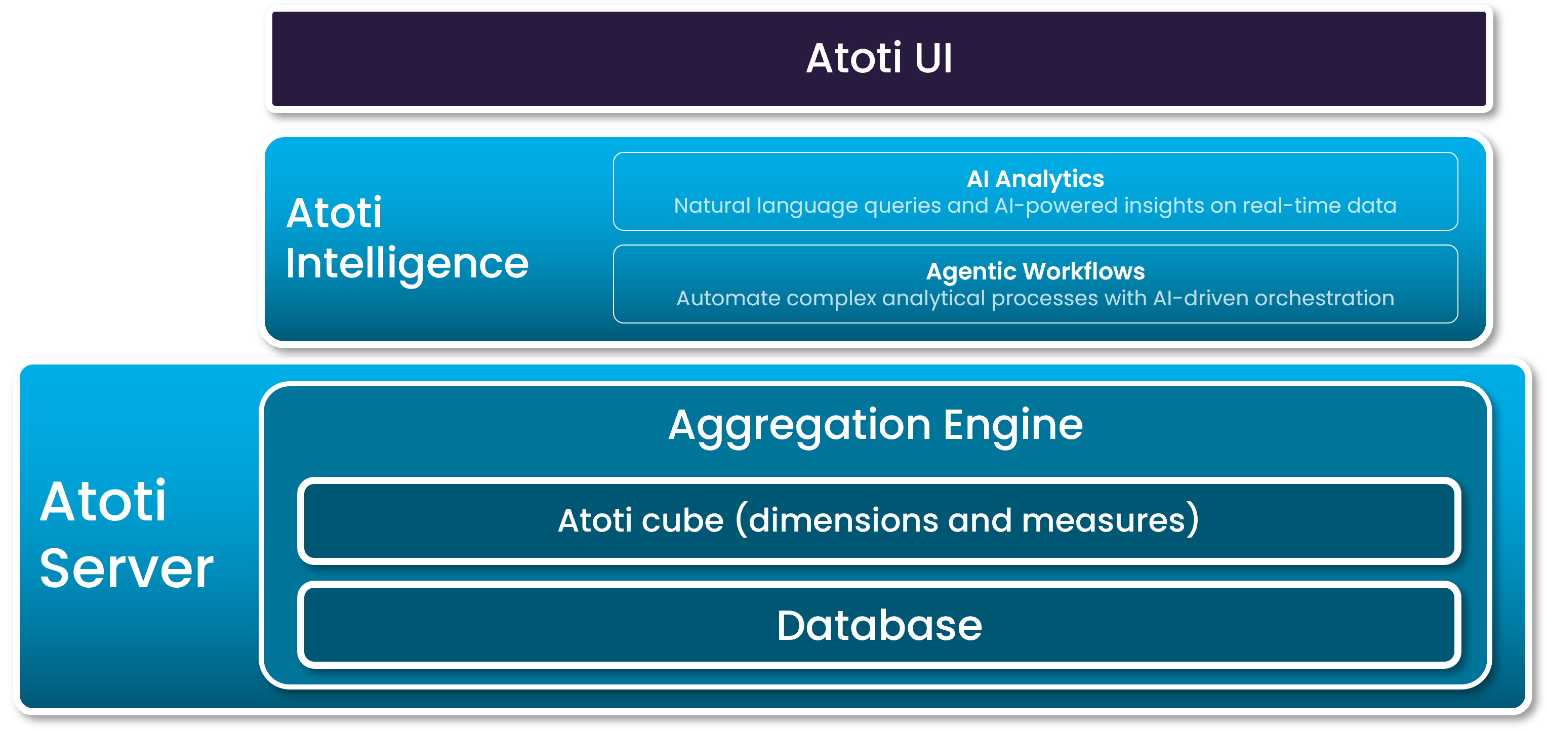
What is the relationship to other Atoti products?
Atoti UI is part of the Atoti platform and requires an existing Atoti application built on the Atoti Engine. It is the primary visual interface for applications configured using the Atoti Java SDK or the Atoti Python SDK, and using Atoti Intelligence. To explore how business users interact with Atoti UI, refer to the User guide. To learn how to customize Atoti UI for your organization, consult the Developer guide. The diagram below shows how Atoti UI provides access to the different layers of the Atoti platform.