Highlight key data
Focus cell is a feature for table widgets. It highlights the full row and full column of a hovered or clicked cell, forming a crosshair pattern. This makes it easier to read values across large tables by visually anchoring a cell's position. The feature is off by default and can be enabled as a user preference or for a specific widget.
How to enable Focus cell
Focus cell can be enabled at two levels: as a user preference in the Settings popup, which acts as the default for your table widgets, or individually for a specific widget.
To enable Focus cell as a user preference:
- Open the Settings popup.
- Toggle Focus cell on.
Widgets that do not have an explicit per-widget override follow this preference. Changing it therefore affects all such widgets, whether existing or new.
To enable Focus cell for a specific widget:
- Click the Behavior icon, next to the data model on the left of the application.
- Toggle Focus cell on or off for the target widget.
The per-widget toggle overrides the user preference for that widget.
Use the per-widget toggle to enable Focus cell on a specific table without changing the preference for your other widgets.
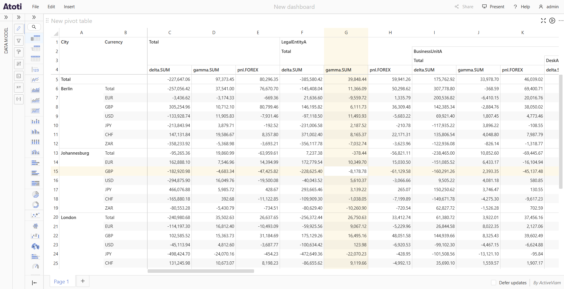
How to highlight a row and column
When Focus cell is enabled, hovering over any data cell, total cell, or subtotal cell highlights the entire row and column that pass through it. The hovered cell itself is not highlighted, so its text remains easy to read.
Moving the cursor to a different cell shifts the highlight to that cell's row and column.
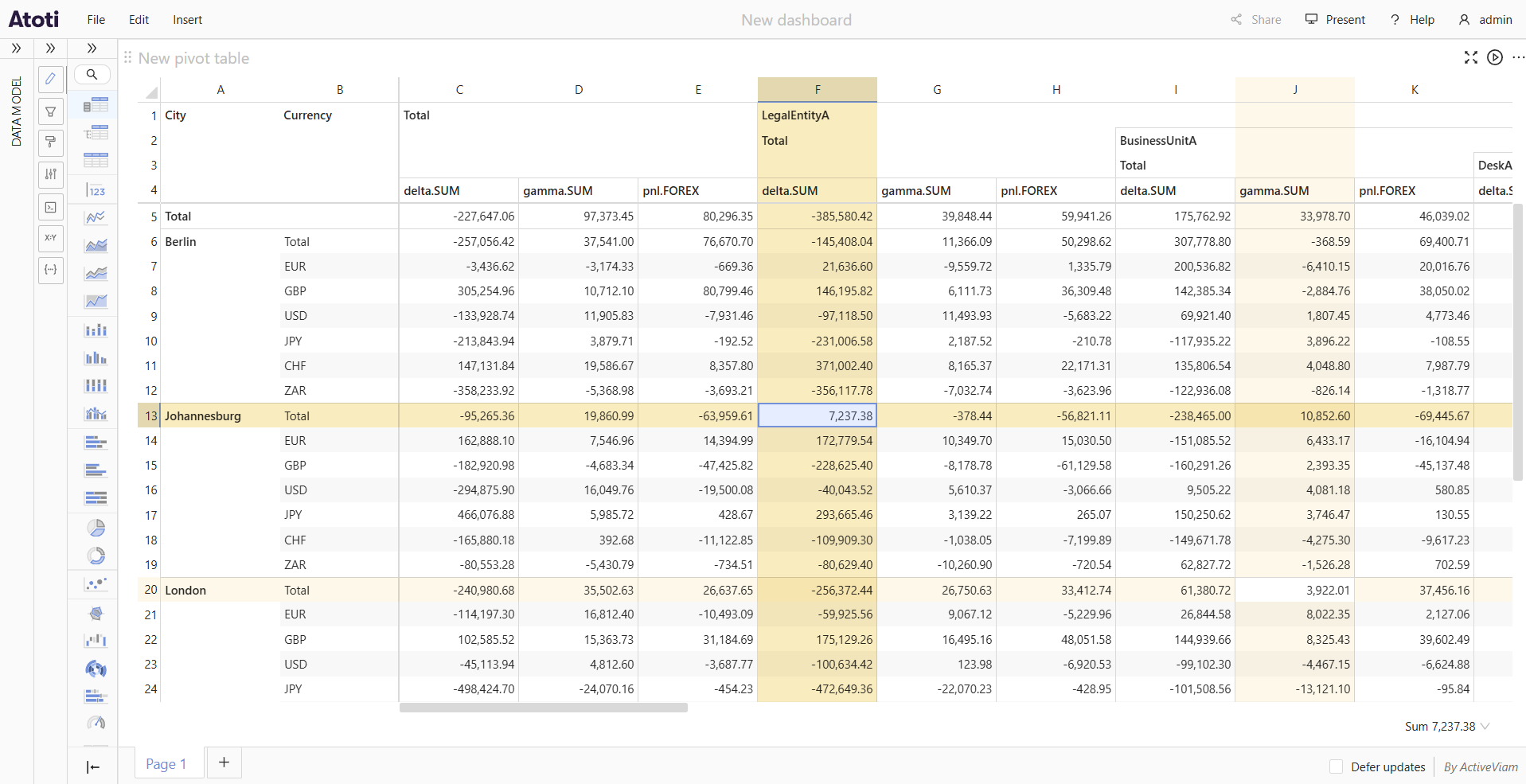
How to pin a highlight
Clicking a cell pins the crosshair highlight at that position. The pinned row and column stay highlighted even after the cursor moves away. The pinned highlight uses a stronger shade than the hover highlight, making it easy to distinguish.
To move the pin, click a different cell. There is only one pinned cell per widget at a time.
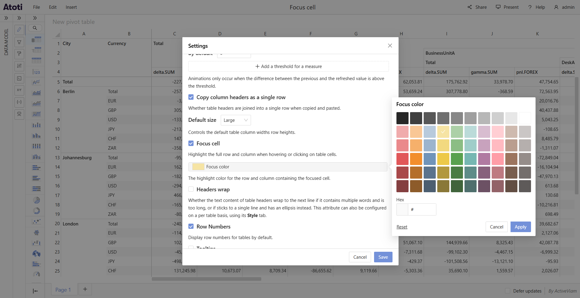
How to customize the highlight color
The Focus color setting controls the color used for both the hover highlight and the pinned highlight. It is a user preference set in the Settings popup; there is no per-widget override for the color. The default is yellow.
To change the highlight color:
- Open the Settings popup.
- Click the Focus color swatch tile to open the color popover.
- Select a color from the preset palette, or type a value directly into the Hex input field.
- To restore the default color, click Reset inside the popover.
- Click Apply to confirm the change, or Cancel to discard it.