Your first custom widget
What are widgets?
- They are Components that can be added to a dashboard.
- They can be saved and reused.
- They can accept action plugins to make them more interactive.
Atoti comes with many stock widgets that require no coding to use.
However, any React Component can be turned into an Atoti widget.
This means that we can develop our own widgets!
Your first custom widget
We will start with a "Hello World!" to get that first bit of code on the screen.
Let's create a couple of new files inside src next to plugins.tsx.
Widget File
The first file contains our widget Component. Since we are building a map of the world, let's name it Map.tsx.
import React, { FC } from "react";

import { WidgetPluginProps } from "@activeviam/atoti-ui-sdk";

export const Map: FC<WidgetPluginProps> = (props) => {
  return <div>Hello World!</div>;
};
Map is a Function Component that accepts WidgetPluginProps (but does not use them yet) and simply returns a div containing "Hello World!".
We will demystify WidgetPluginProps later on in this section.
Plugin Widget File
Let's create the second file in the same location and call it pluginWidgetMap.ts.
Take note of the naming here. When defining plugins its good practice to stick with the following formula:
- Start with
"plugin". - Reveal the type of
"plugin". In this case it is a"widget", but it also could have been a"cell"or a"menuItem". - Provide the underlying component's name . In this case we are calling it
"map".
That brings us to a final name of pluginWidgetMap.
import { WidgetPlugin } from "@activeviam/atoti-ui-sdk";

import { Map } from "./Map";

const widgetKey = "map";
export const pluginWidgetMap: WidgetPlugin = {
  Component: Map,
  initialState: { widgetKey },
  key: widgetKey,
};
Let's stop a minute and decipher this.
We defined pluginWidgetMap which is a widget plugin. But what is widget plugin?
Simply put, a widget plugin is an object containing all the information needed to register a new widget in Atoti.
By editing this object, we can change how this widget will look and behave.
pluginWidgetMap contains three properties so far:
- Component is the thing that actually gets displayed. In our case it is
Map. - key identifies the widget, which will be useful when we want to display it in a dashboard.
- initialState is a bit more complex and we will explore it more in the next section.
Extend Atoti UI
Let's wire our new widget into Atoti!
- Open up
plugins.tsx. - Add
pluginWidgetMapinto thewidgetPluginsarray.
The widgetPlugins array is eventually passed to the plugin registry. This is how Atoti UI knows what plugins it has.
+ import { pluginWidgetMap } from "./pluginWidgetMap";

...

// Make sure to put it at the top of `widgetPlugins` so it becomes the first widget in the Widgets Panel. This will make it easier to find in the coming steps.
const widgetPlugins: Array<WidgetPlugin> = [
+ pluginWidgetMap,
  pluginWidgetPivotTable,
  ...
]
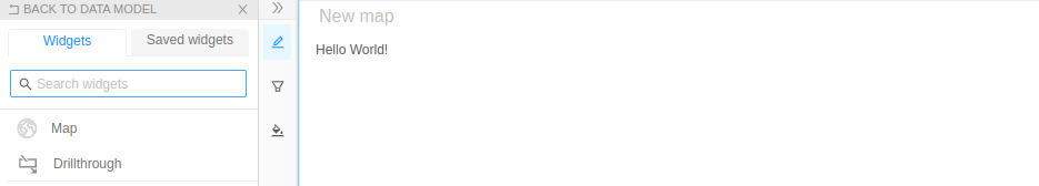
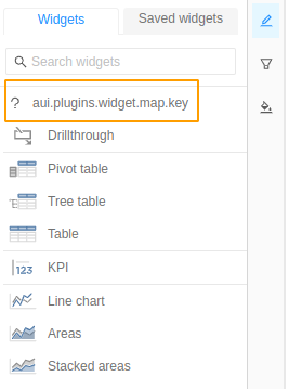
It worked! Our new widget appeared:
We can drag and drop it into the dashboard to see our Component:
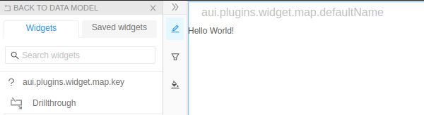
…but there are a few strange things going on:
- Without styling, "Hello world!" is stuck on the left edge.
- The question mark icon in the widgets panel does not relate to our widget at all.
- There are two weird labels:
aui.plugins.widget.map.keyused as the widget description.aui.plugins.widget.map.defaultNamein the widget's title in the upper left corner of the widget.
Let's scratch these itches before we move on.
To improve your experience, save the dashboard now. Your URL will now end with /dashboard/<id> where "id" is a short string. From here on out, each time you refresh the page, you will end up directly on your widget.
Add Style
Since Map is a React Component, we could easily hardcode a horizontal padding onto it. However, our widget can be used in other contexts (like an Atoti notebook) where that hardcoded style might not look good.
For this reason, widgets accept a style prop passed in from their parents. This style prop contains all the styling needed to make a widget look good inside its parent. Now we just have to wire that styling in.
const Map: FC<WidgetPluginProps> = (props) => {
  return (
-    <div>
+    <div style={props.style}>
      Hello World!
    </div>
  );
};
With this change, Map allows its parent (in our case, the dashboard) to control its style. Now our map will look good in a dashboard as well as in a notebook (which would pass its own style object down).
Add an icon
Because pluginWidgetMap is a WidgetPlugin, it has an Icon property where we can attach an icon to represent our Component.
We will download a new file, IconWorld.tsx. It contains a React Component that displays a globe icon. This makes it perfect for our map! Click here to download it.
Place IconWorld.tsx next to Map.tsx and wire it into our pluginWidgetMap's Icon property:
+ import { IconWorld } from "./IconWorld";


  export const pluginWidgetMap: WidgetPlugin = {
    Component: Map,
+   Icon: IconWorld,
    initialState: {
      widgetKey,
    },
    key: widgetKey,
  };
Add translations
Now on to those two weird labels we spotted earlier.
Because Atoti UI is made to work with any language, it expects plugins to provide translations for all the locales it is going to support, starting with en-US.
While you can have as many translation entries as you like, the following two are required for all widgets:
key, used as the widget description.defaultName, used as a placeholder for the widget's title.
You might be asking youself: how did they know to use key and defaultName?
These keys are actually the last words in the weird labels we spotted: aui.plugins.widget.map.key and aui.plugins.widget.map.defaultName. Atoti UI adds the other text based on what kind of plugin you're using (WidgetPlugin in our case) and the plugin's key.
Let's head back into pluginWidgetMap.ts to add a translations property to the plugin:
import { IconWorld } from "./IconWorld";

export const pluginWidgetMap: WidgetPlugin = {
  Component: Map,
  Icon: IconWorld,
  initialState: {
    widgetKey,
  },
  key: widgetKey,
+ translations: {
+   "en-US": {
+     key: "Map",
+     defaultName: "New map"
+   }
+ }
};
You can (and should) add more translations every time you add another caption to your widget. This way, you will fully support your widget's different locales. More on this later in the tutorial. 😊
Congratulations, you just created your first Atoti widget!