> ## Documentation Index
> Fetch the complete documentation index at: https://docs.activeviam.com/llms.txt
> Use this file to discover all available pages before exploring further.
# Edit the style of a widget
> How to style widgets in Atoti UI using the Style tab, including formatting numerical values per measure, adding conditional and default styles for table cells and chart traces, table size and header wrap settings, and chart axis titles, legends, data labels, point sizes, and trace colors.
The style of a [widget](../about-widgets) can be edited using the **Style** tab. This can be accessed from the **Tools panel**, next to the [data model](../../../navigate-atoti-ui/data-model) on the left of the application. Open the **Style** tab by clicking its icon.
Different aspects of a widget can be modified depending on its type, for example you can change the [size of a table](#table-size), or add [axis titles](#axis-titles) to a chart, therefore the **Style** tab will contain different sections depending on the type of the selected widget.
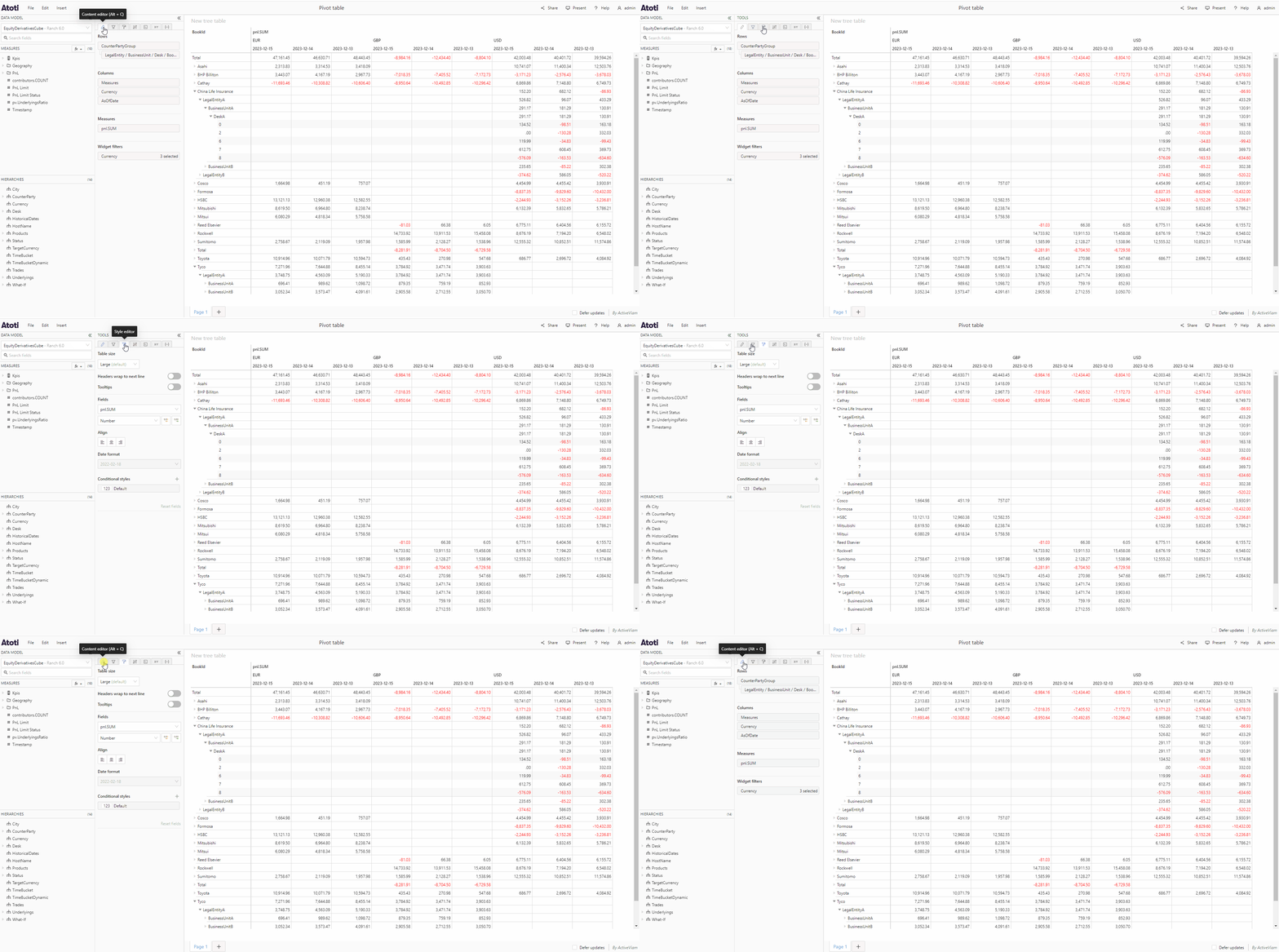 The **Style** tab is available for all widget types except gauge and bullet
charts.
## Format values
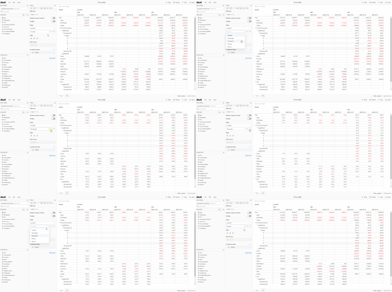
You can choose the format of display for numerical values on a per [measure](../../../navigate-atoti-ui/data-model#measure) basis.
* Select a measure from the dropdown at the top of the **Style** tab.
* Choose the format of display from the next dropdown. The default is **Number**, the other options are **Percentage**, **Thousands**, **Millions** and **Billions**.
* You can also use the red and green arrows next to the dropdown to control how many decimal places are shown for the values of the chosen measure.
The **Style** tab is available for all widget types except gauge and bullet
charts.
## Format values
You can choose the format of display for numerical values on a per [measure](../../../navigate-atoti-ui/data-model#measure) basis.
* Select a measure from the dropdown at the top of the **Style** tab.
* Choose the format of display from the next dropdown. The default is **Number**, the other options are **Percentage**, **Thousands**, **Millions** and **Billions**.
* You can also use the red and green arrows next to the dropdown to control how many decimal places are shown for the values of the chosen measure.
 On charts, formatting the numbers will change the value displayed in the
tooltip when hovering a chart point, and on the [**Data
labels**](#data-labels) if you have enabled these.
## Conditional styles
A conditional style can be applied *conditionally* to a widget, depending on the value of a member. In the **Conditional styles** section of the **Style** tab, you can add rules which will apply a color only to the members which fulfill the requirements, for example you could choose to highlight in green all members with a value greater than 0. How this color is applied will depend on the [widget type](../about-widgets#types-of-widgets).
| Chart type | Applied to |
| ---------------- | ------------ |
| Table | Table cells |
| Line/radar chart | Chart points |
| Column chart | Columns |
| Bar chart | Bars |
| Pie/Donut chart | Sectors |
### Add a conditional style
To add a conditional style:
* If your widget has more than one measure, select the measure on which you wish to apply the conditional style from the dropdown at the top of the **Style** tab.
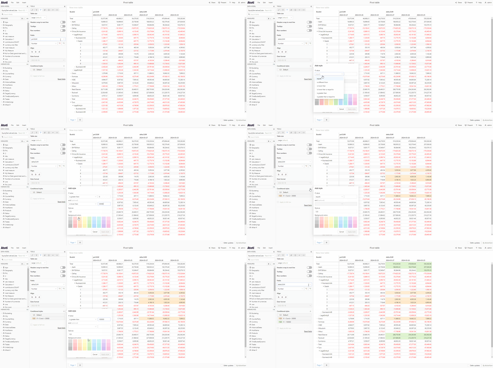
* Click the **+** icon next to the title **Conditional styles**, this will open a popup containing some inputs and a color palette.
* Use the first dropdown to create your rule and the input box next to it to specify a value. For example, if you want to highlight all cells less than 0, choose *is lower than* from the dropdown and enter *0* in the input box.
* Optionally add a second condition to your rule using the second dropdown and input.
* Choose a color from the color palette.
* Click **Apply style**.
Conditional styles are displayed as tiles in the **Style** tab. Their rules are applied in the order of the tiles, from top to bottom, with each new rule taking priority over any previous rules. For example, if I have a measure with the values 15 and 25, if I first add a rule where values > 10 are blue, then add a rule where values > 20 are green, 15 will be blue and 25 will be green. However if I had added the second rule first, both values would be blue.
Conditional style tiles can be reordered by dragging and dropping, which will
change the order in which their rules are applied.
On charts, formatting the numbers will change the value displayed in the
tooltip when hovering a chart point, and on the [**Data
labels**](#data-labels) if you have enabled these.
## Conditional styles
A conditional style can be applied *conditionally* to a widget, depending on the value of a member. In the **Conditional styles** section of the **Style** tab, you can add rules which will apply a color only to the members which fulfill the requirements, for example you could choose to highlight in green all members with a value greater than 0. How this color is applied will depend on the [widget type](../about-widgets#types-of-widgets).
| Chart type | Applied to |
| ---------------- | ------------ |
| Table | Table cells |
| Line/radar chart | Chart points |
| Column chart | Columns |
| Bar chart | Bars |
| Pie/Donut chart | Sectors |
### Add a conditional style
To add a conditional style:
* If your widget has more than one measure, select the measure on which you wish to apply the conditional style from the dropdown at the top of the **Style** tab.
* Click the **+** icon next to the title **Conditional styles**, this will open a popup containing some inputs and a color palette.
* Use the first dropdown to create your rule and the input box next to it to specify a value. For example, if you want to highlight all cells less than 0, choose *is lower than* from the dropdown and enter *0* in the input box.
* Optionally add a second condition to your rule using the second dropdown and input.
* Choose a color from the color palette.
* Click **Apply style**.
Conditional styles are displayed as tiles in the **Style** tab. Their rules are applied in the order of the tiles, from top to bottom, with each new rule taking priority over any previous rules. For example, if I have a measure with the values 15 and 25, if I first add a rule where values > 10 are blue, then add a rule where values > 20 are green, 15 will be blue and 25 will be green. However if I had added the second rule first, both values would be blue.
Conditional style tiles can be reordered by dragging and dropping, which will
change the order in which their rules are applied.
 ### Add a default style
In contrast to a conditional style, a default style is applied to all members of the selected measure unconditionally. However, it has the lowest priority and is overwritten by any conditional styles.
To add a default style:
* Hover the tile with the name **Default** in the **Style** tab, you will see some icons appear on the right of the tile.
* Click the **edit** icon, this will open a popup containing a color palette.
* Choose a color, then click **Apply style**.
### Add a default style
In contrast to a conditional style, a default style is applied to all members of the selected measure unconditionally. However, it has the lowest priority and is overwritten by any conditional styles.
To add a default style:
* Hover the tile with the name **Default** in the **Style** tab, you will see some icons appear on the right of the tile.
* Click the **edit** icon, this will open a popup containing a color palette.
* Choose a color, then click **Apply style**.
 ### Edit a conditional/default style
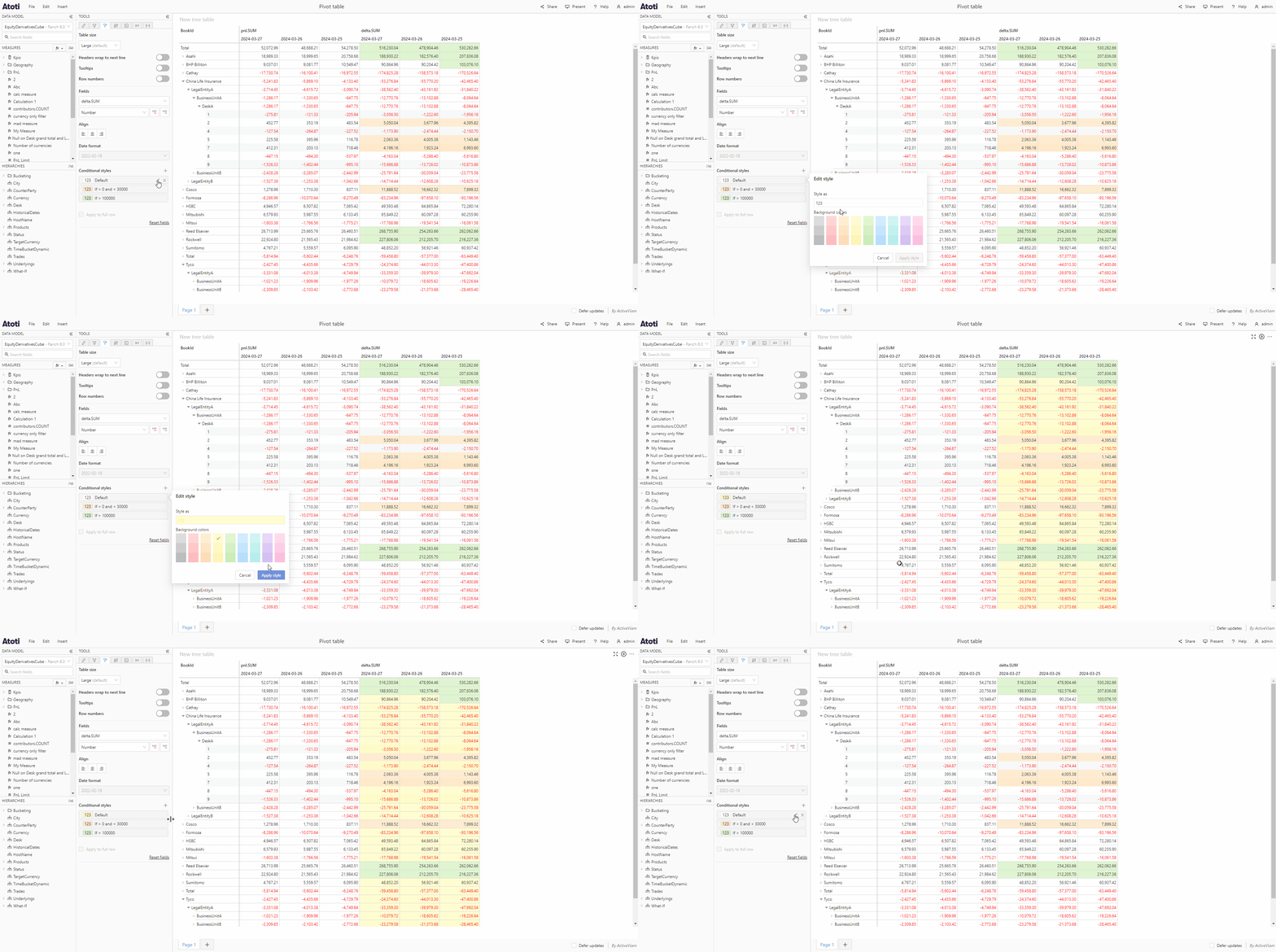
To edit a conditional or default style:
* Hover over the corresponding tile in the **Style** tab, you will see some icons appear on the right of the tile.
* Click the **edit** icon, this will open the **Edit style** popover.
* Make your changes, either to the rules or the colors, then click **Apply style**.
On table widgets, you can choose to apply conditional or default styles to
entire rows (as opposed to individual cells) when the value of the cell in the
column corresponding to the selected measure fulfills the condition(s). To do
so, click the **Apply to full row** checkbox.
### Remove a conditional/default style
To remove a conditional or default style:
* Hover over the corresponding tile in the **Style** tab, you will see some icons appear on the right of the tile.
* Click the **X** icon.
## Reset fields
Clicking the **Reset fields** button will remove any default or conditional styles and number formatting that has been applied to a widget.
## Table styles
The following section of the **Style** tab will only be visible if the selected widget is a [table](../about-widgets#tables).
### Table size
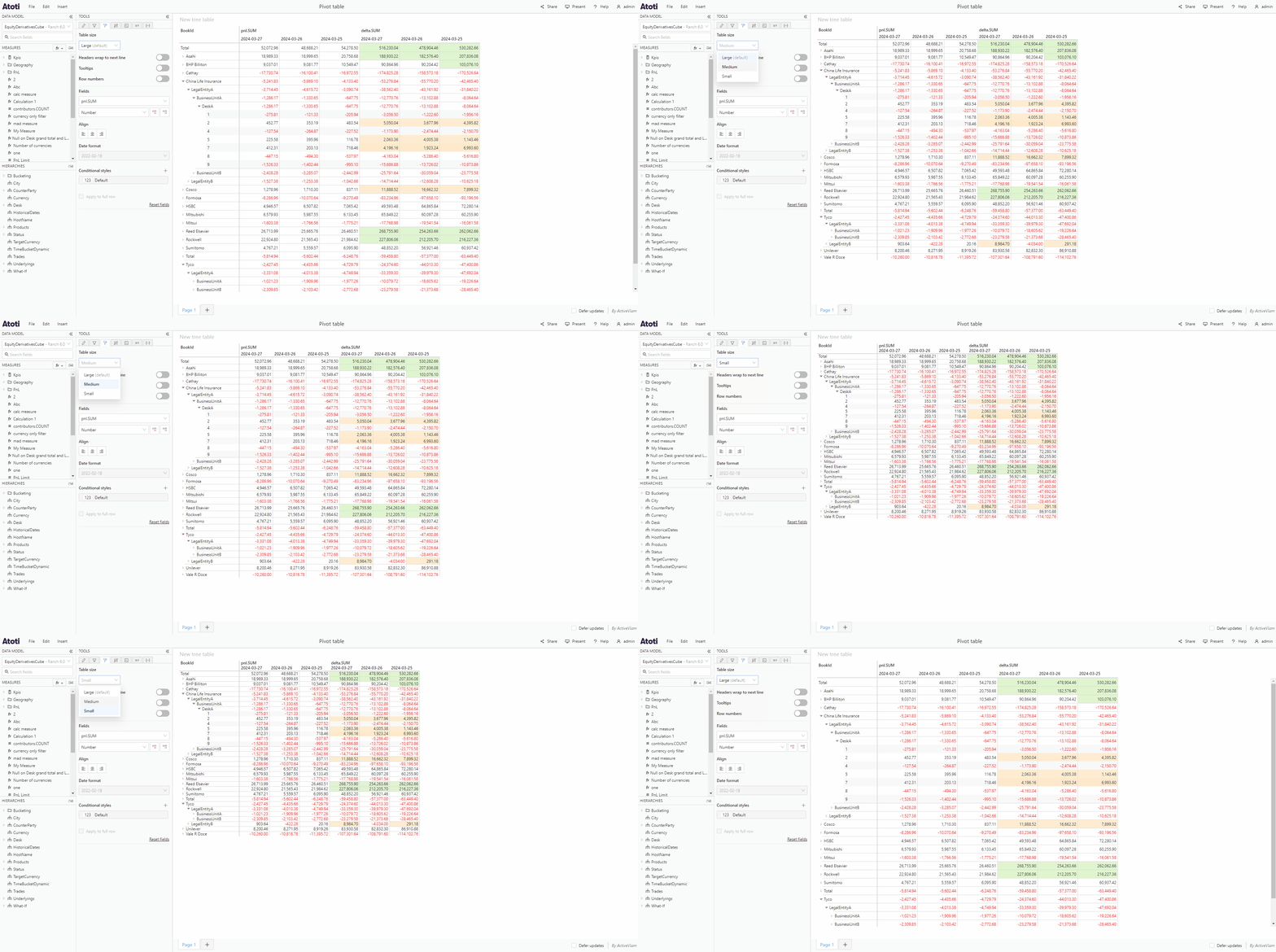
Table widgets can be made 3 different sizes: **small**, **medium** or **large**.
* To change the table size use the **Table size** dropdown to select the required size.
### Edit a conditional/default style
To edit a conditional or default style:
* Hover over the corresponding tile in the **Style** tab, you will see some icons appear on the right of the tile.
* Click the **edit** icon, this will open the **Edit style** popover.
* Make your changes, either to the rules or the colors, then click **Apply style**.
On table widgets, you can choose to apply conditional or default styles to
entire rows (as opposed to individual cells) when the value of the cell in the
column corresponding to the selected measure fulfills the condition(s). To do
so, click the **Apply to full row** checkbox.
### Remove a conditional/default style
To remove a conditional or default style:
* Hover over the corresponding tile in the **Style** tab, you will see some icons appear on the right of the tile.
* Click the **X** icon.
## Reset fields
Clicking the **Reset fields** button will remove any default or conditional styles and number formatting that has been applied to a widget.
## Table styles
The following section of the **Style** tab will only be visible if the selected widget is a [table](../about-widgets#tables).
### Table size
Table widgets can be made 3 different sizes: **small**, **medium** or **large**.
* To change the table size use the **Table size** dropdown to select the required size.
 The default table size can be configured via the **table.defaultSize**
[setting](../../../../developer-guide/customize-atoti-ui/user-settings).
### Headers wrap
Sometimes, the text content of a header cell (at the top of a table) is too long to fit. **Headers wrap** allows you to control what happens in this situation. When switched on, the text wraps and is displayed on several lines. When switched off, the overflowing part of the text is truncated and an ellipsis is shown. The full text can be seen in a tooltip, visible when hovering over the cell.
* To switch the table header text wrapping on or off, toggle the **Headers wrap** switch in the **Style** tab.
The default table header text wrapping can be configured for all tables at
once using the **table.headers.wrap**
[setting](../../../../developer-guide/customize-atoti-ui/user-settings).
### Table cell tooltips
Tooltips appear when hovering over table cells. They allow you to see at a glance which members a specific figure corresponds to, which is otherwise not always obvious in a large table.
* To switch table cell tooltips on or off, toggle the **Tooltips** switch in the **Style** tab.
This does not affect tooltips on cells with truncated texts, which remain
always on.
The default visibility of table tooltips can be configured for all tables at
once using the **table.tooltips**
[setting](../../../../developer-guide/customize-atoti-ui/user-settings).
### Row numbers
Row numbers can be useful in order to identify specific rows in a large table. They also enable selecting a whole row by clicking on its number.
* To show or hide row numbers, toggle the **Row numbers** switch in the **Style** tab.
The default visibility of row numbers for tables can be configured using the
**table.rowNumbers**
[setting](../../../../developer-guide/customize-atoti-ui/user-settings).
## Chart styles
The following sections of the **Style** tab will only be visible if the selected widget is a [chart](../about-widgets#charts).
### Axis titles
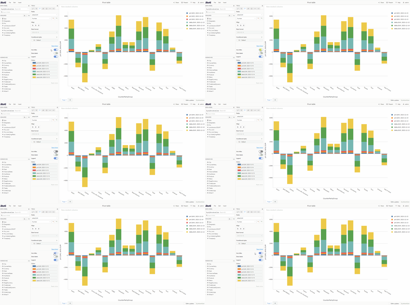
Axis titles display the names of hierarchies and measures used in a chart, on the X and Y axes. For example, a simple line chart with *City* on the **X axis** and *delta.SUM* on **Values** in the **Fields** tab would display the title *City* under the chart, parallel to the X axis, and *delta.SUM* on the left, parallel to the Y axis. If a chart contains more than one measure or hierarchy, these will all appear in the axis title as a list separated by commas.
* To add or remove axis titles, toggle the switch in the **Style** tab.
The default table size can be configured via the **table.defaultSize**
[setting](../../../../developer-guide/customize-atoti-ui/user-settings).
### Headers wrap
Sometimes, the text content of a header cell (at the top of a table) is too long to fit. **Headers wrap** allows you to control what happens in this situation. When switched on, the text wraps and is displayed on several lines. When switched off, the overflowing part of the text is truncated and an ellipsis is shown. The full text can be seen in a tooltip, visible when hovering over the cell.
* To switch the table header text wrapping on or off, toggle the **Headers wrap** switch in the **Style** tab.
The default table header text wrapping can be configured for all tables at
once using the **table.headers.wrap**
[setting](../../../../developer-guide/customize-atoti-ui/user-settings).
### Table cell tooltips
Tooltips appear when hovering over table cells. They allow you to see at a glance which members a specific figure corresponds to, which is otherwise not always obvious in a large table.
* To switch table cell tooltips on or off, toggle the **Tooltips** switch in the **Style** tab.
This does not affect tooltips on cells with truncated texts, which remain
always on.
The default visibility of table tooltips can be configured for all tables at
once using the **table.tooltips**
[setting](../../../../developer-guide/customize-atoti-ui/user-settings).
### Row numbers
Row numbers can be useful in order to identify specific rows in a large table. They also enable selecting a whole row by clicking on its number.
* To show or hide row numbers, toggle the **Row numbers** switch in the **Style** tab.
The default visibility of row numbers for tables can be configured using the
**table.rowNumbers**
[setting](../../../../developer-guide/customize-atoti-ui/user-settings).
## Chart styles
The following sections of the **Style** tab will only be visible if the selected widget is a [chart](../about-widgets#charts).
### Axis titles
Axis titles display the names of hierarchies and measures used in a chart, on the X and Y axes. For example, a simple line chart with *City* on the **X axis** and *delta.SUM* on **Values** in the **Fields** tab would display the title *City* under the chart, parallel to the X axis, and *delta.SUM* on the left, parallel to the Y axis. If a chart contains more than one measure or hierarchy, these will all appear in the axis title as a list separated by commas.
* To add or remove axis titles, toggle the switch in the **Style** tab.
 ### Axis labels
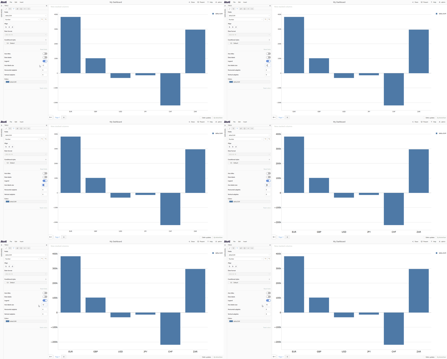
To change the font size of axis labels, change the value of **Axis labels size** in the **Style** tab.
### Axis labels
To change the font size of axis labels, change the value of **Axis labels size** in the **Style** tab.
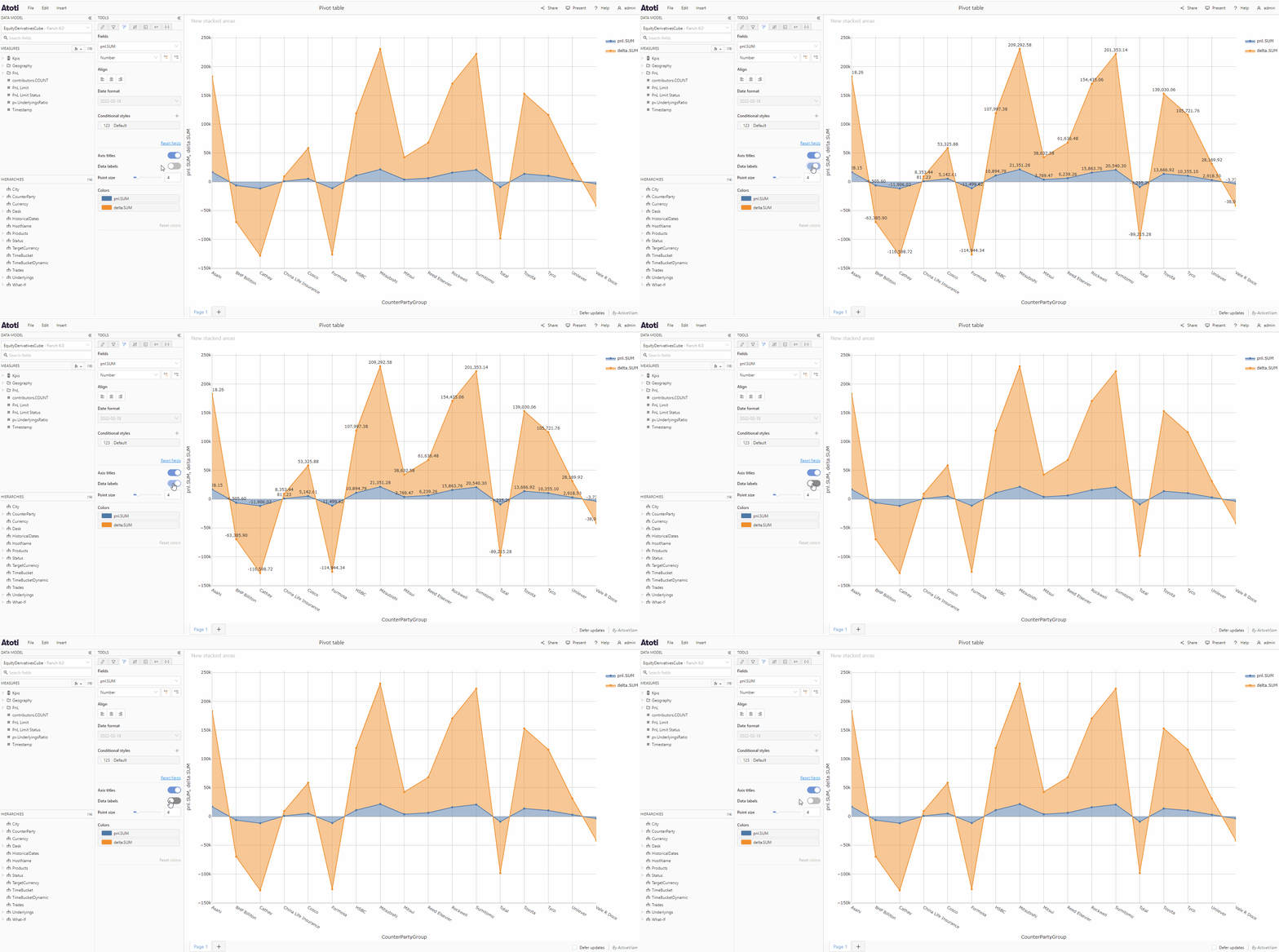
 ### Data labels
Data labels can be used to display values on a chart. For line charts, the data labels will appear next to each chart point, for bar and columns charts they will appear inside the bar or column, and for pie or donut charts they will appear inside each sector. To change the format or number of decimal places shown in the data labels, see [format values](#format-values).
* To add or remove data labels, toggle the switch in the **Style** tab.
### Data labels
Data labels can be used to display values on a chart. For line charts, the data labels will appear next to each chart point, for bar and columns charts they will appear inside the bar or column, and for pie or donut charts they will appear inside each sector. To change the format or number of decimal places shown in the data labels, see [format values](#format-values).
* To add or remove data labels, toggle the switch in the **Style** tab.
 ### Colors
The **Colors** section of the **Style** tab enables you to change the colors of a chart. Where this color is applied will depend on the chart type.
| Chart type | Applied per | Applied to |
| --------------- | ----------- | -------------------- |
| Line chart | Measure | Chart trace and area |
| Column chart | Measure | Columns |
| Bar chart | Measure | Bars |
| Pie/Donut chart | Member | Sectors |
| Scatter plot | Member | Markers |
To change the chart colors:
* In the **Colors** section, you will see tiles for each measure (for line, column or bar charts) or each member (for pie/donut charts or scatter plots).
* Hover over the tile for the measure/member for which you wish to change the color, you will see an **edit** icon appear on the right of the tile.
* Click the **edit** icon to open the **Edit colors** popover.
* Choose a color from the color palette, or choose a custom color by entering a hex color code in the input box.
* Click **Apply color**.
### Colors
The **Colors** section of the **Style** tab enables you to change the colors of a chart. Where this color is applied will depend on the chart type.
| Chart type | Applied per | Applied to |
| --------------- | ----------- | -------------------- |
| Line chart | Measure | Chart trace and area |
| Column chart | Measure | Columns |
| Bar chart | Measure | Bars |
| Pie/Donut chart | Member | Sectors |
| Scatter plot | Member | Markers |
To change the chart colors:
* In the **Colors** section, you will see tiles for each measure (for line, column or bar charts) or each member (for pie/donut charts or scatter plots).
* Hover over the tile for the measure/member for which you wish to change the color, you will see an **edit** icon appear on the right of the tile.
* Click the **edit** icon to open the **Edit colors** popover.
* Choose a color from the color palette, or choose a custom color by entering a hex color code in the input box.
* Click **Apply color**.
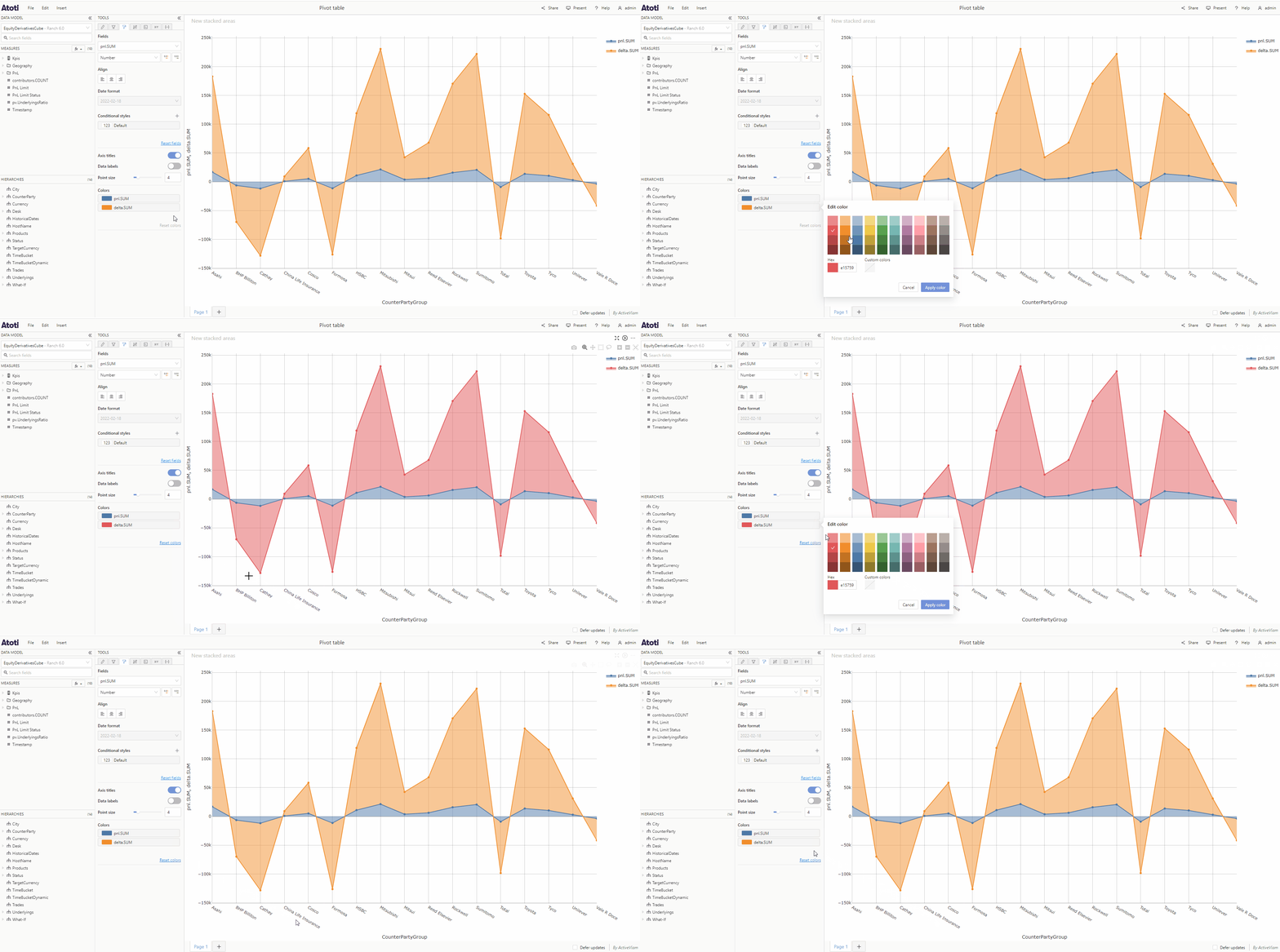 You can reset all colors back to their defaults by clicking the **Reset colors** button at the bottom right of the **Colors** section.
If there is a default or conditional style applied to the chart, this will
override the chart colors for all chart types except line charts (because
default/conditional styles affect the chart points whereas the color affects
the chart trace and area).
### Legend
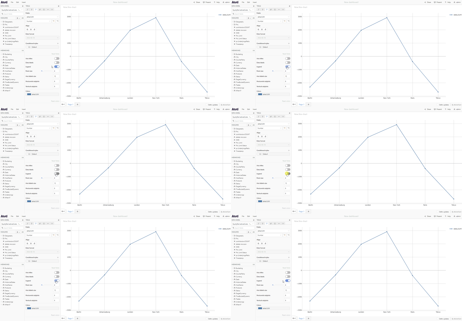
To hide or show chart legends, toggle the **Legend** switch in the **Style** tab.
You can reset all colors back to their defaults by clicking the **Reset colors** button at the bottom right of the **Colors** section.
If there is a default or conditional style applied to the chart, this will
override the chart colors for all chart types except line charts (because
default/conditional styles affect the chart points whereas the color affects
the chart trace and area).
### Legend
To hide or show chart legends, toggle the **Legend** switch in the **Style** tab.
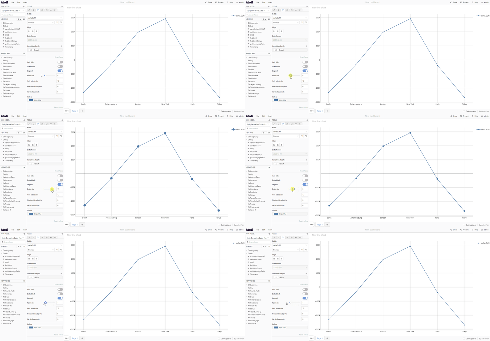
 ### Point size
To change the size of chart points, change the value of **Point size** in the **Style** tab.
### Point size
To change the size of chart points, change the value of **Point size** in the **Style** tab.